Satisfaction surveys are a special opportunity to get in touch with your customer. First of all, they obviously offer the possibility to improve your product thanks to the feedback you receive.
These surveys are often shared through specific emails. Depending on how you set up these satisfaction survey emails, they can also represent a special opportunity to enhance the customer relationship.
However, a failed satisfaction survey email will result in few returns, and may even damage the customer relationship.
In this article we guide you through the best practices to make your satisfaction survey emails successful, with 20 examples of emails!
Sommaire
13 examples of successful satisfaction survey emails
#1 The email that focuses on the simplicity and effectiveness of the message
Object
: Dropbox support : Tell us how we did
From
: Dropbox
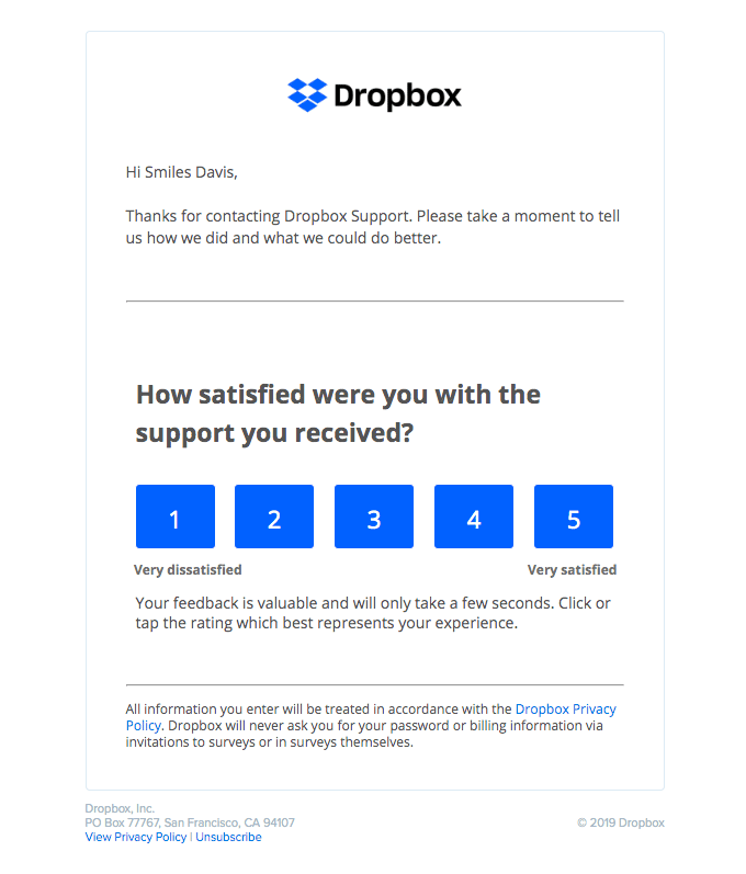
Translation
Hello Smile Davis,
Thank you for contacting Dropbox support. Please let us know how it went, and what we could do better.
How satisfied were you with the support you received?
1 (really satisfied) 2 – 3 – 4 – 5 (very satisfied)
Your feedback is valuable and will only take a few seconds. Click or tap on the score that best represents your experience.
What we like:
- The buttons in the email to answer in one click: it simplifies the experience, and it’s very effective.
- The intelligibility of the score – 1 to 5: it works well on mobile (unlike 10), there is no difficulty to understand, and it is more neutral than the stars.
- The simplicity of the email and the contextualization: ” You contacted support – tell us how it went and what we could do better” .
What we like less:
- The lack of humanization: the email is sent by “Dropbox”, it is not signed, and the automatic and dehumanized side is totally assumed. On the one hand, this may allow for more objective feedback. On the other hand, it certainly affects response rates.
#2 The simple, effective email that adapts to all media
Object
How are we doing?
From
: Squarespace
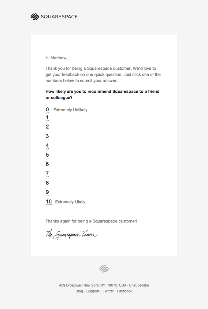
Translation
Hello Matthew,
Thank you for being a Squarespace customer. We’d love to hear your feedback on a quick question. Simply click on one of the numbers below to submit your response.
How likely are you to recommend Squarespace to a friend or colleague?
0 (Very unlikely) – 1 – 2 – 3 – 4 – 5 – 6 – 7 – 8 – 9 – 10 (Very likely).
Thanks again for being a Squarespace customer.
The Squarespace team.
What we like:
- The buttons in the email to answer in one click: again it simplifies the experience, and it’s very effective.
- The intelligibility of the score – 1 to 10: it takes more space than the previous example, but it also works well on mobile, because the score is arranged vertically, not horizontally.
What we like less:
- Lack of humanity: It’s a bit more human, but when the email is signed “The XYZ Team” you can feel that the “personal” side is simulated.
#3 The email that capitalizes on the brand’s universe
Object
: How did you sleep?
From
: Casper
Translation
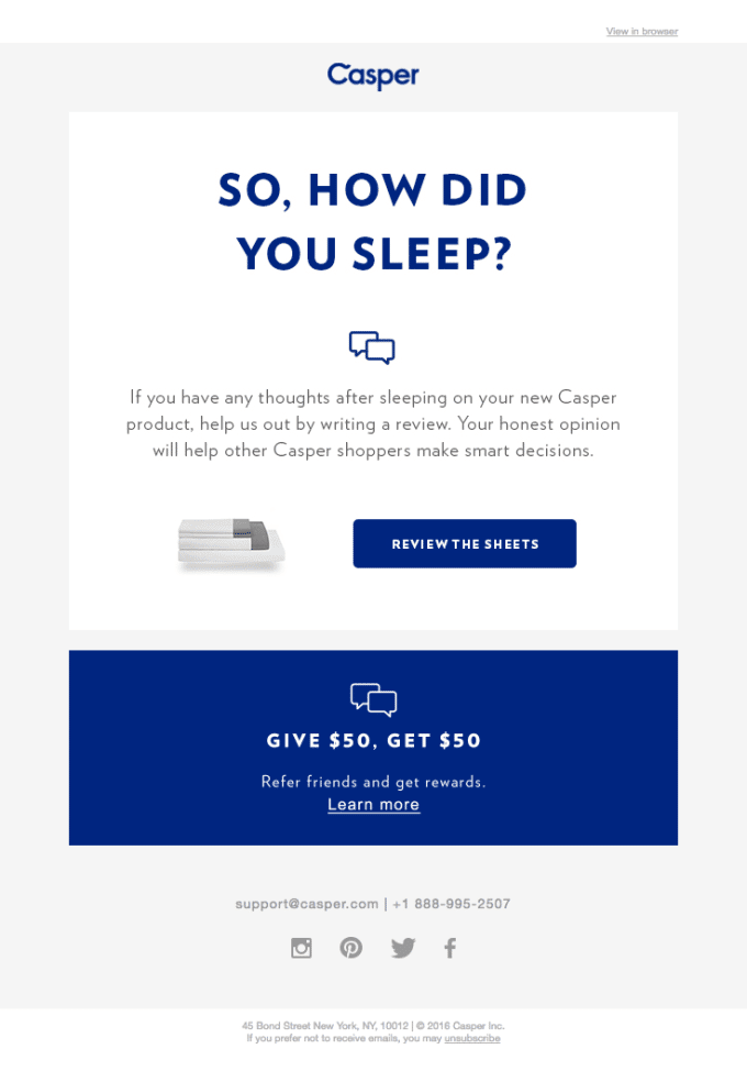
So how did you sleep?
If you have any thoughts after sleeping on your new Casper product, help us by writing a review. Your honest opinion will help other Casper buyers make smart decisions.
Give your opinion.
What we like:
- The subject of the email: very specific and precise, and at the same time original, it makes you want to open it and it participates in the brand universe of Casper (mattress brand).
- The specificity of the email: it includes the purchased product and highlights it next to the button.
What we like less:
- The lack of humanity: here again the email is very dehumanizing, even if there is an effort to make the brand friendly.
#4 The email that is unlike any other
Object
: Write a review for Smiles Davis
From
: Airbnb
Translation
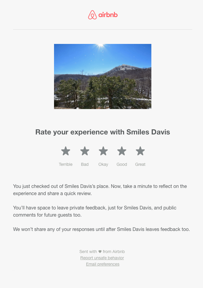
Rate your experience with Smile Davis.
Horrible – Bad – Fair – Good – Great.
You’ve just left Smile Davis housing. Now take a moment to reflect on the experience and share a quick review.
You will have space to share private feedback, just for Smile Davis, and also public comments for future guests.
We won’t share any of your responses until Smile Davis shares its feedback as well.
Sent with ❤️ by Airbnb.
What we like:
- Contextualization: it’s simple and precise. They put a picture of the place, remind the context quickly, and specify the next steps and the operation in detail.
- The stars: you can click on them directly from the email, it allows you to go faster, and you immediately understand the subject. For the most advanced emails, the stars are colored when you move the mouse over them.
#5 The email that values you (and your time)
Object
Help us improve Slack by taking this survey
From
: Slack
Translation
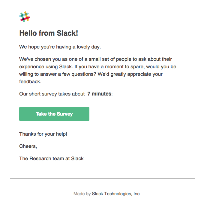
Hello, from Slack!
We hope you have a nice day.
We’ve chosen you to be part of a small group of people to be interviewed about their experience using Slack. If you have a moment to spare, would you be willing to answer a few questions? We would greatly appreciate your feedback.
Our short survey takes about 7 minutes.
Take the survey.
Thank you for your help!
Greetings,
Slack’s research team.
What we like:
- It is ultra clear and precise: the subject line is clear, the body of the email is clear. Every word counts, and there is not one too many.
- The somewhat personalized aspect: it may sound a bit fake, but you readily believe that you are part of a specific segment and the first sentence is quite effective.
What we like less:
- The impersonal signature: we’re still not a fan of “The xyz team”, but it’s a personal opinion.
#6 The short and simple email, but addressed to you and not to someone else
Object
: First Came Sketch, Next Comes…
From
: Abstract
Translation
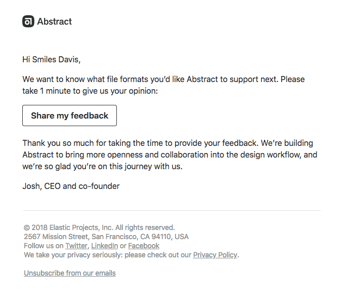
What we like:
- The question is very precise and clear: from the subject of the email, to the contextualization, to the end of the email: which platform do you want us to add?
- It’s very simple and precise, and that’s what works.
- The personalization side is pretty well done: we know the email wasn’t written by Josh, but we want to believe that he took a look at it before sending, or at least that he participated in the decision to ask the customers.
#7 The engaging email that makes you want to help
Object
: We want to hear from you! ✈️
From
: Uber
Translation
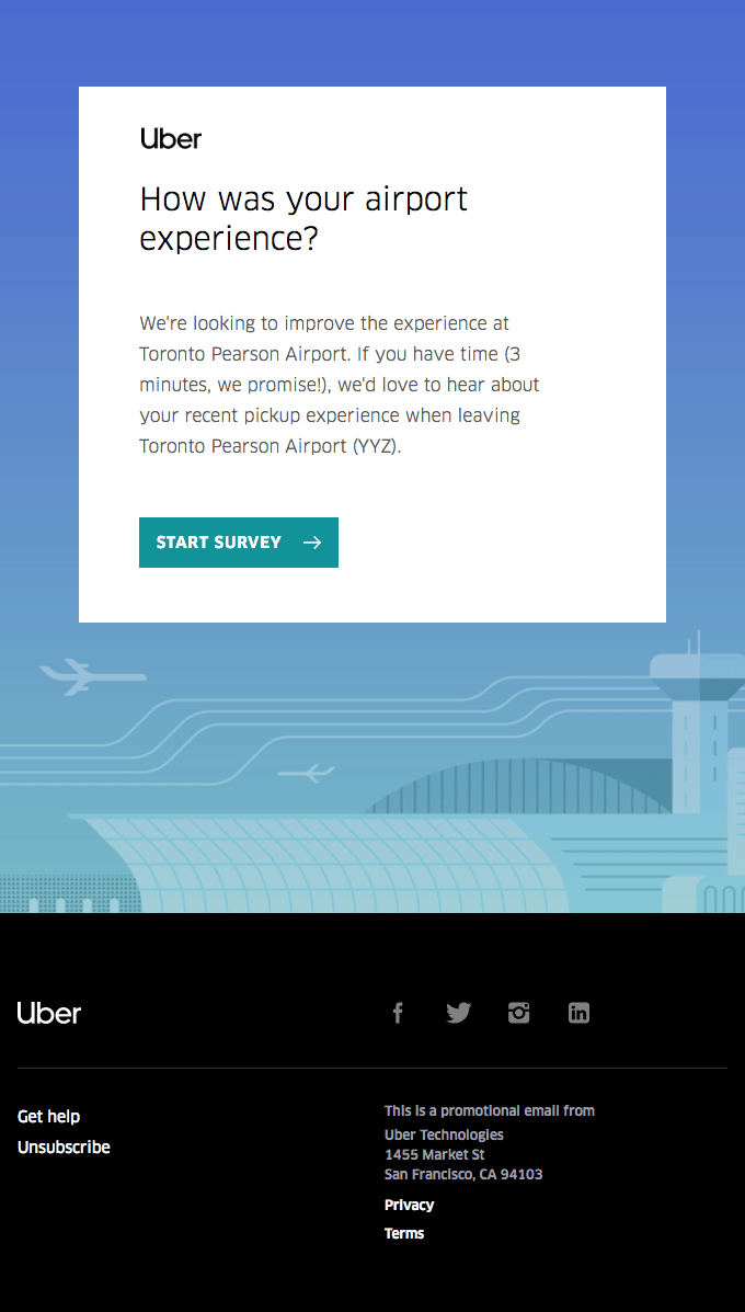
How was your experience at the airport?
We’re looking to improve the experience at Toronto Pearson Airport. If you have time (3 minutes, I promise!), we’d love to hear about your recent experience running from Toronto Pearson Airport (YYZ).
Start the survey.
What we like:
- Accuracy and contextualization: Again, it’s very specific and the context is brought in simply and effectively: “We’re looking to improve the experience at Toronto Pearson Airport. If you have time (3 minutes, I promise!), we would like to know about your recent experience. If you live in Toronto, you’re pretty tempted to do this.
What we like less:
- The subject of the mail: too vague, we do not understand the emoji. Too bad, the title of the mail could have been much better.
#8 The email that will reward you for your time
Object
: We’d like to hear from you!
From
: Twitch
Translation
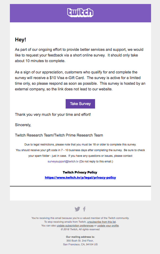
Hey!
As part of our ongoing efforts to provide better service and support, we would like to ask for your feedback through a short online survey. It should only take about 10 minutes to complete.
As a token of appreciation, customers who qualify and complete the survey will receive a $10 Visa gift card. The survey is active for a limited time only, so please respond as soon as possible. This survey is hosted by an outside company, so the link is not to our website.
Take the survey.
Thank you so much for your time and effort!
Sincerely,
Twitch Research Team / Twitch Prime Research Team.
What we like:
- It is very clear and precise: they even specify that the form is hosted on another site than theirs, and that it is normal. In 5 sentences, they deliver a lot of information.
What we like less:
- As far as motivation is concerned, it’s not great: the subject of the email is very classic and a bit boring (probably under 20% of opening). The very formal and precise message doesn’t give an overwhelming desire to participate. Clearly, they are counting on the $10 gift card to convince. Why not, it has the merit of being clear.
#9 The email that marks the anniversary of your “customer meeting
Object
: Day 30. What’s happened so far?
From
: Bellroy
Translation
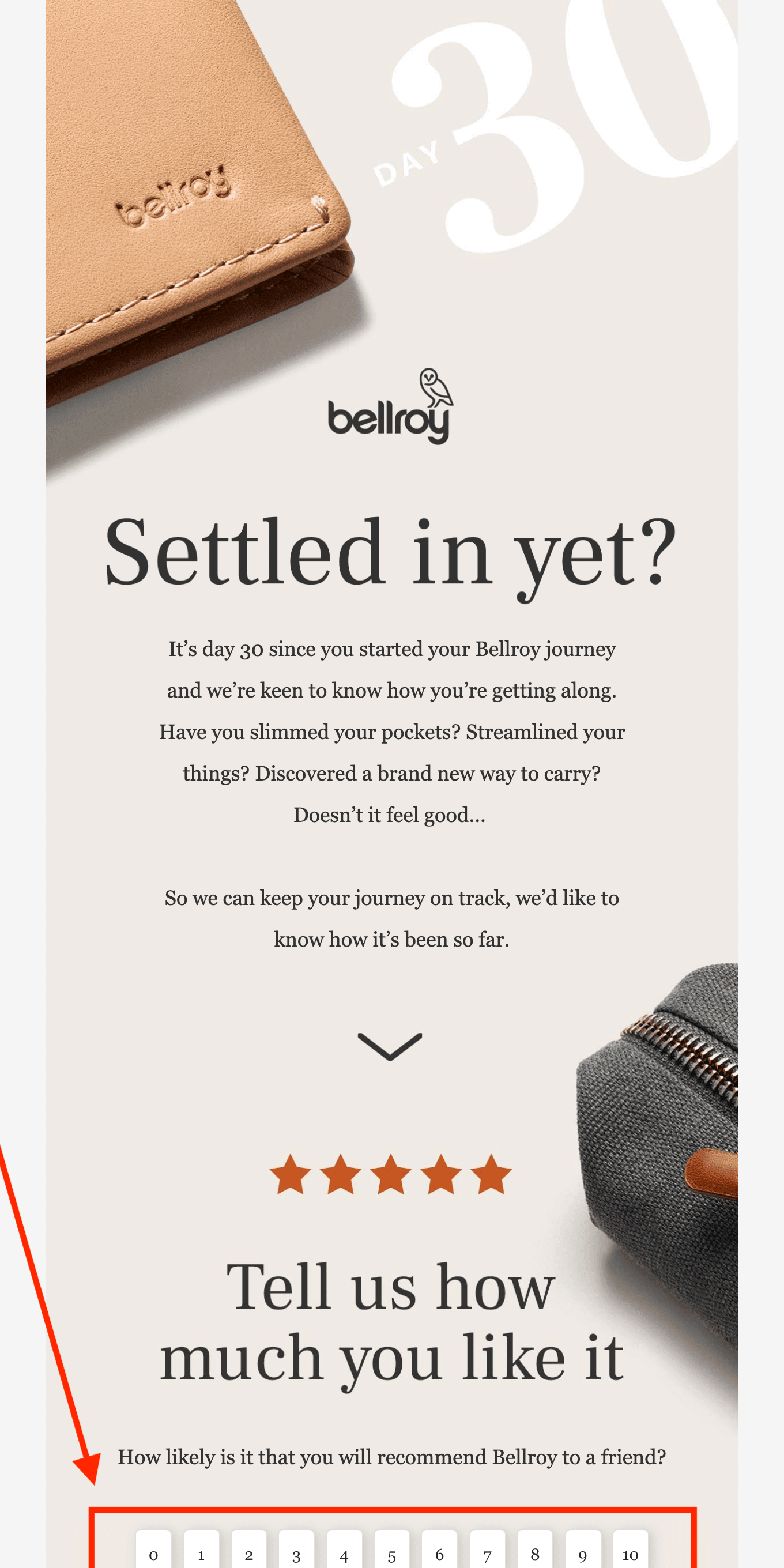
You are already installed?
It’s been 30 days since you started your journey with Bellroy and we’d like to know how you’re doing. Have you lightened your pockets? Streamlined your business? Discovered a whole new way of living? Isn’t it nice…
To keep us on track, we would like to know what you have done so far.
Tell us if you like it
How likely are you to recommend Bellroy to a friend?
0 – 1 – 2 – 3 – 4 – 5 – 6 – 7 – 8 – 9 – 10
What we like:
- The alibi is very clear, and included in the subject line: “it’s been 30 days […] and we’d like to know how you’re doing“.
- The email is actually an NPS email: with the 11 buttons at the bottom of the email. It’s simple, sober, and quite effective.
What we like less:
- What we regret a little, is that the NPS buttons are very far at the bottom of the mail, and rather little visible.
#10 Feedback on your participation
Object
: here’s the goop
From
: Hers
Translation
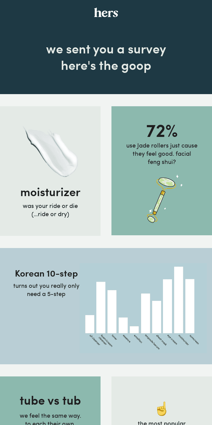
We sent you a survey, here are the results.
Moisturizer: it was your walk or die (… walk or die)
72% of you use jade rolls just because you feel good. Facial feng shui ?
The Korean method has 10 steps, but in reality only 5 are needed.
What we like:
- The presentation of results: this is an excellent idea. When you take part in a survey, you like to have the results. However, it is quite rare that we are informed, especially for the product questionnaires, which are supposed to help to consider the evolutions of the product. And that’s a shame! It doesn’t cost much to set up, it generates a lot of commitment, and in the best of cases it even allows you to create a segment of “super-users” who want to be kept informed. And that’s very valuable.
Without pushing too hard, if you ask a question, remember to give the answers 🙂
#11 The email that is not afraid to go into detail
Object
Smiles Davis, share your thoughts and get a chance at a $200 gift card!
From
: Everlane
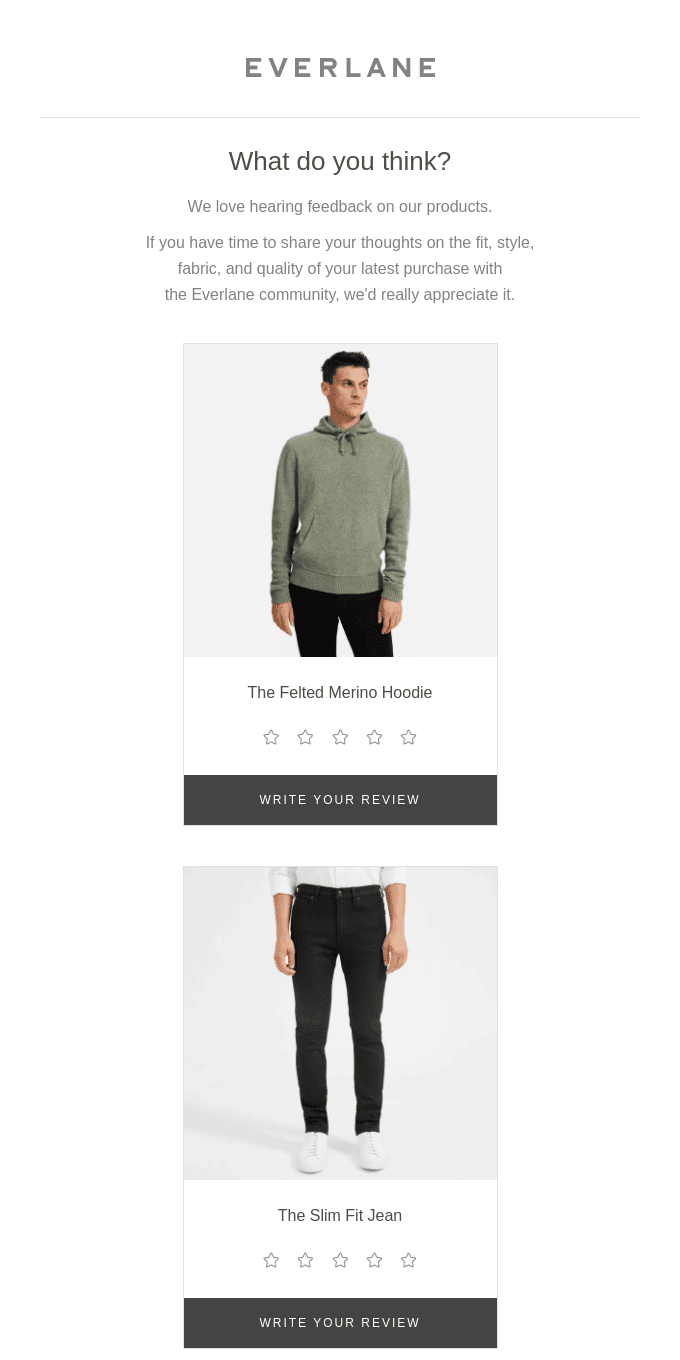
Translation
What do you think about it?
We love to receive feedback on our products. If you have the time to share your thoughts on the fit, style, fabric and quality of your latest purchase with the Everlane community, we would appreciate it.
The felted merino hoodie :
Give your opinion
The Slim Fit jean :
Give your opinion
What we like:
- The object is very clear, and powerful at the same time: it is super successful.
- The idea of the raffle: to inflate the offer. We’re not huge fans, but maybe it works.
- The contextualization is successful: with photos of the products purchased that you can rate directly with a star system.
- The introductory sentence is powerful: it presents several elements to be evaluated to form an opinion: the size, the cut, the material, the quality…
- The “per product” aspect is also interesting: In B2B we usually see emails that ask for a very general opinion on the service as a whole. We can really learn from the multi-product approach to ask much more detailed questions.
#12 The engaging email that asks a simple and precise question
Object
: How was your order with My Ivy Thai?
From
: Yelp
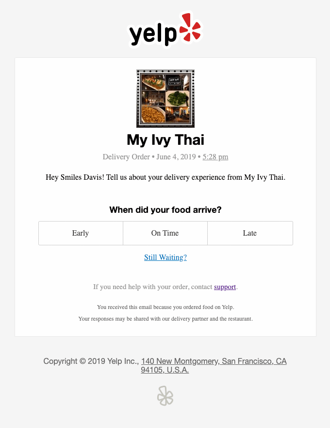
Translation
My Ivy Thai
Hey Smile Davis, Tell us about your experience delivering My Ivy Thai.
When did your food arrive?
Early – On time – Late
Are you still waiting?
If you need help with your order, please contact the help desk.
What we like:
- It is precise and efficient: the date, the name of the restaurant etc. are recalled to contextualize.
- The most powerful thing about this email is the question that is asked: instead of a generic question about the experience as a whole, it’s super specific, and super easy to answer. In the genre of starting with closed questions, it’s the best.
- The survey path: answer then leads to a form with several other questions in the same style, and some more open-ended questions at the end of the form. Airbnb has also been doing this for some time, asking Yes / No questions like “Is there a dishwasher at XYZ?”.
Maximizing participation rates is a real job, so we might as well be inspired by those who have been working on it for a long time!
#13 The email that directly integrates a satisfaction form
Object
Forms in email? It’s possible!
From
: Litmus
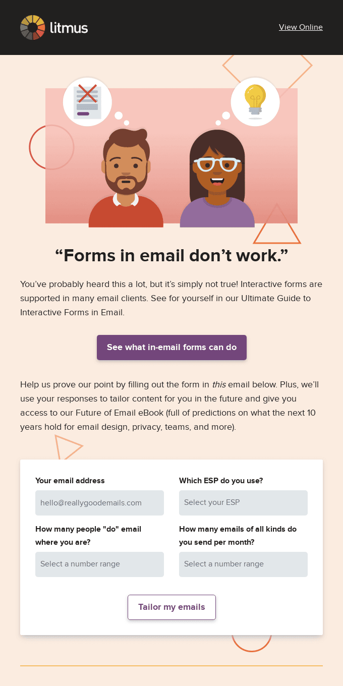
Translation
“Forms in emails don’t work”.
You’ve probably heard this a lot, but it’s simply not true! Interactive forms are supported by many email clients. See for yourself in our Ultimate Guide to Interactive Forms in Email.
Find out what forms in emails can do.
Help us prove our point by filling out the form in this email below. Plus, we’ll use your responses to tailor content to your needs in the future and give you access to our Future of Email eBook (full of predictions about what the next 10 years hold for email design, privacy, teams, etc.).
What we like:
- The form in the email: we have selected this email mainly to show that it is now possible to integrate forms directly into emails. Google Workspace does this when it allows you to reply to comments directly from an email.
The use cases are actually quite limited, mainly because it involves open questions. If the questions are closed, one click is enough and you get away with buttons. But it is possible!
7 examples of failed satisfaction survey emails
#1 The email that has badly segmented its targets
Object
How are things going with 1Password?
From
: G2
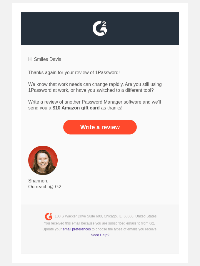
Translation
Hi Smiles Davis
Thanks again for your review of 1Password!
We know that business needs can change quickly. Are you still using 1Password at work, or have you switched?
Write a review about another password management software and we’ll send you a $10 Amazon gift card as a thank you!
Write a comment.
Shannon
What we like:
- The signature: it’s the only thing that we can find appreciable in this email. It’s a pity that it’s the worst email of this list that is signed.
What we like less:
- The alibi is very bad: the e-mail is based on the fact that the receiver gave his opinion on a password management tool. So far so good. But the alibi used is the following: have you changed your tool since then? If so, give your opinion on the tool you use now. Out of the huge volume of people who received this email, it is pretty sure that only 2 or 3% were concerned by the message. That’s a total miss.
- The “Write a review” button leads to a series of pages without coherence or interest: it could have been avoided. The 2 or 3% concerned must be sufficiently motivated by the $10 to go through 4 screens before giving their opinion.
#2 The email that loses you in a succession of forms
Object
: We need your software stories!
From
: G2
Translation
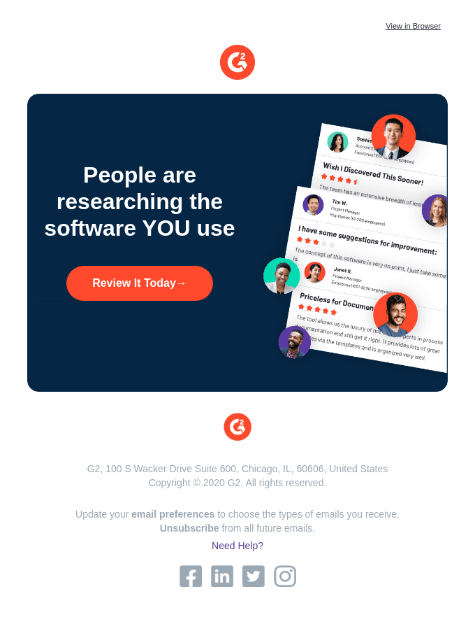
People are researching the software YOU use.
Evaluate it today.
What we don’t like:
- The dehumanized version probably sent to the whole planet: Even worse! This email says nothing, can be addressed to anyone (and shows it well with several faces on the image) and brings no value to the reader.
- Same catastrophic experience if you still want to try to give your opinion.
#3 The email that promises to be anonymous, but isn’t
Object
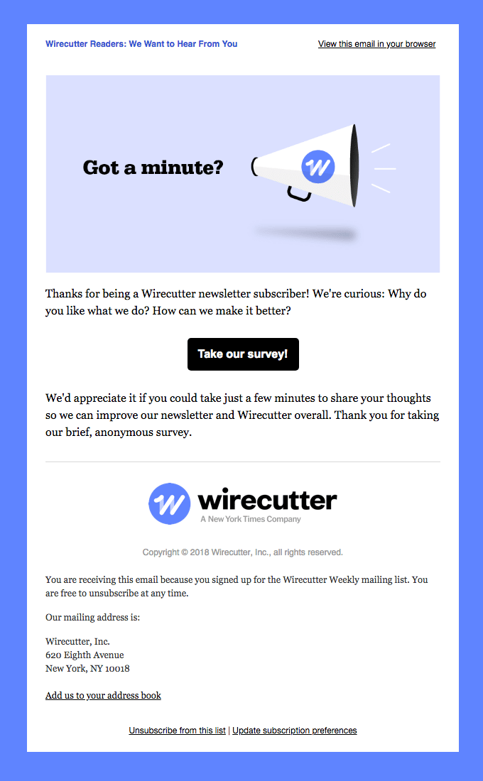
: Wirecutter Readers: We Want to Hear From You
From
: Wirecutter
Translation
Do you have a minute?
Thank you for being a Wirecutter newsletter subscriber! We are curious: Why do you like what we do? How can we improve it?
Take our survey!
We would appreciate it if you would take a few minutes to give us your feedback so that we can improve our newsletter and Wirecutter in general. Thank you for taking our brief anonymous survey.
What we don’t like:
- Vagueness: this is probably one of the best of the worst, but overall it is very vague.
- The object is very standard: it does not give any added value.
- The questions that lead to the call to action are ultra vague: “Why do you like what we do?”; “What can we improve?”… As much as possible, start with closed and precise questions.
- False anonymity: Less serious, but still, they wrote that the questionnaire is anonymous. When you send a link by email, you know who clicks. Unless you really make the effort to avoid it (which is not the case here), the form is not anonymous at all. It wasn’t necessary to say that, and it looks bad when you realize it’s not true.
#4 The very (too) banal email
Object
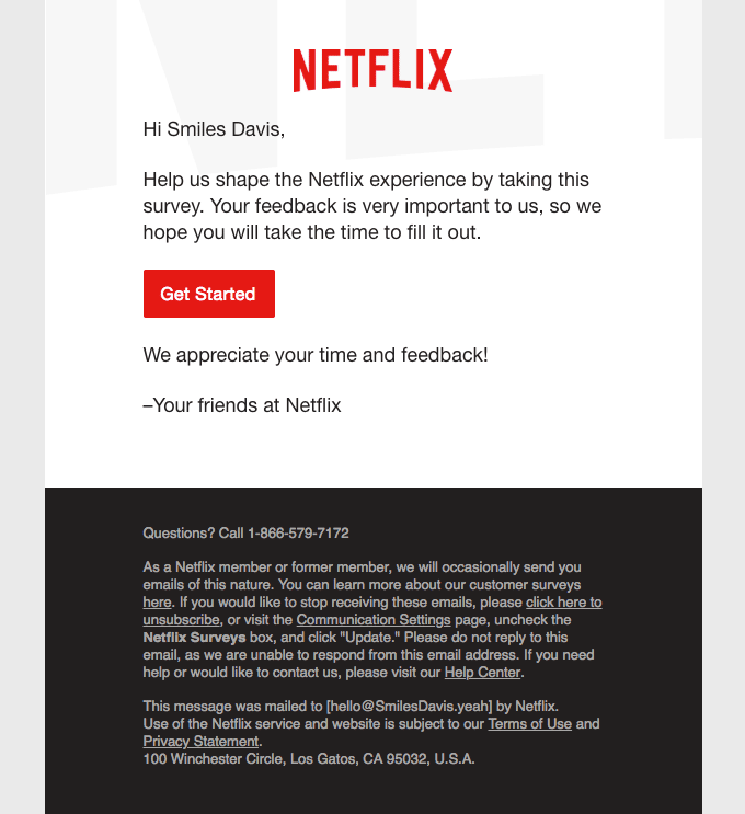
: Netflix Values Your Opinion
From
: Netflix
Translation
Hey Smile Davis,
Help us shape the Netflix experience by taking this survey. Your feedback is very important to us, so we hope you’ll take the time to complete it.
Get started.
We appreciate your time and feedback!
Your friends at Netflix.
What we don’t like:
- The banality: Netflix clearly didn’t spend much time on this email. It’s confoundingly banal.
- The overly forced valuation: “Netflix values your opinion”, “Your feedback is very important to us”: clearly it doesn’t sound very sincere.
If you’re asking your audience for something, be humble enough to work on your email.
#5 The email that is too long and badly structured
Object
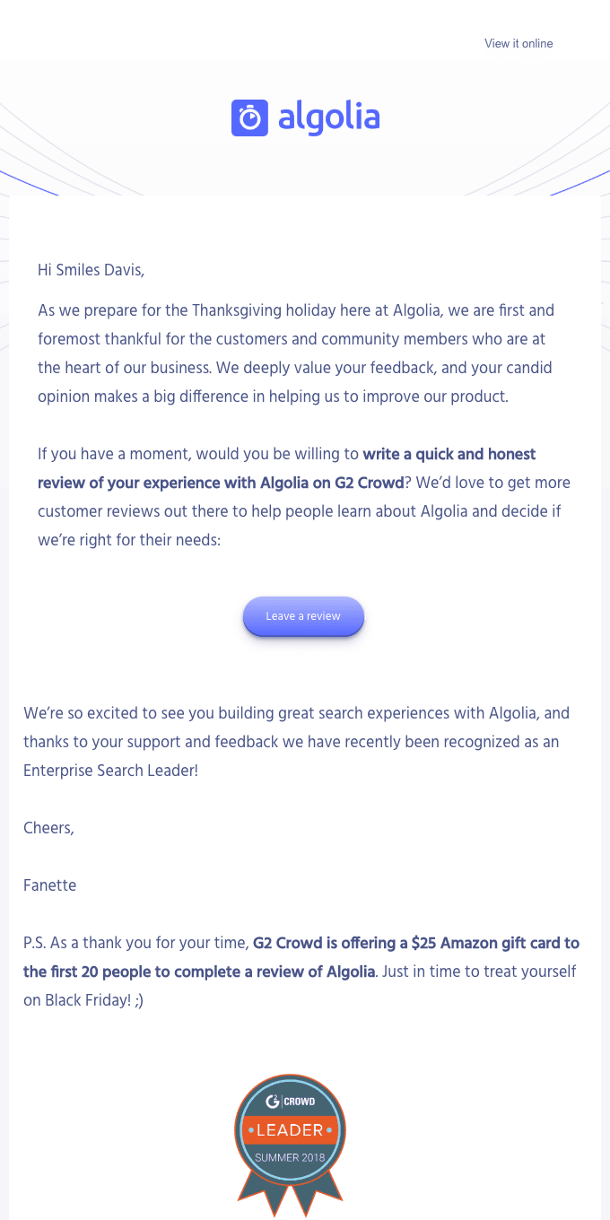
Claim your giftcard in time for Black Friday! Review Algolia
From
: Algolia
Translation
Hi Smile Davis,
As we prepare for the Thanksgiving vacation, here at Algolia, we are most grateful for the customers and community members who are at the heart of our business. We value your feedback, and your honest opinion makes a big difference in helping us improve our product.
If you have a moment, would you be willing to write a quick and honest review of your experience with Algolia on G2 Crowd? We’d love to have more customer reviews to help people discover Algolia and decide if we’re right for them:
Leave a comment
We’re thrilled to see you building great search experiences with Algolia, and thanks to your support and feedback, we were recently recognized as a leader in enterprise search!
Thank you,
Fanette,
PS: As a thank you for your time, G2 Crowd is offering a $25 Amazon gift certificate to the first 20 people who give their review of Algolia. Just in time to treat yourself on Black Friday 😉
What we like:
- The object is quite powerful: it manages to create a sense of urgency while remaining very clear.
What we like less:
- The body of the email is catastrophic: It’s long, it doesn’t say anything… The only sentence that’s even slightly important is written in bold, as if the person who wrote it considered that the rest of the text is only there to fill in.
- The $25 offer : it’s the subject of the email, and it’s detailed only in Postscript…
- No prioritization of messages: no synthesis exercise, it seems that it was written much too quickly.
- Irrelevant call to action: We don’t understand at all the secondary call to action at the bottom of the email: “register to Algolia“. It seems that the email is sent to Algolia users to ask for a G2 opinion? It’s either a targeting problem or a call to action problem, but clearly it has nothing to do there.
#6 The generic email that drowns you in the mass
Object
: Your recent experience with Lyft
From
: Lyft
Translation
Your opinion is important to us.
We’d love to hear about your recent experience with Lyft. Got a minute?
Fill out a quick survey.
Thank you for being part of the Lyft community!
The Lyft team.
What we don’t like:
- Useless and impersonal email: In the generic genre, without any interest, and without any motivation, we are in the bull’s eye. The only merit of this email is to exist – which is already not bad.
#7 The email that skimped on the details
Object
: A couple of questions for you…
From
: Ritual
Translation
Hello,
We know each other well by now – and we’d love to hear your thoughts on all things Ritual.
We are always looking for ways to improve, so we would appreciate it if you would take this short survey. We promise that it will only take a few minutes.
Simply click on the button below to get started.
Take the survey.
To your health.
Emma
What we like:
- We like the fact that it’s signed by a real human: it’s a bit like a personal email. Too bad it’s always the worst emails that are signed
What we like less:
- It’s a lot of words for not much: no offer, no details on the form itself, no information on the context or the use that will be made of the collected data, it’s very basic.
4 Best practices to maximize response rates to your satisfaction survey emails
#1 Ask a specific question and provide context
Don’t be too general: a lot of people are asked for their opinion, so it’s an issue for :
- Stand out from the competition.
- That the customer understands the expectations: asking for feedback on a specific product he bought, rather than on “his overall customer experience on the proposed service” just doesn’t sound the same).
Put your request in a precise context: this allows you to better justify and legitimize the request (even if the objective of continuous improvement is commendable):
- The temporality of your customer relationship: one day anniversary (30 days since your purchase or registration, for example).
- An external event: Thanksgiving, Black Friday, the arrival of spring: all pretexts can be good to anchor precisely a satisfaction survey.
- A specific location: this is the example of Uber’s email and the Toronto airport experience. The idea is to make the customer understand that they are not just helping to make Uber World better: they are helping to improve the Toronto airport experience in particular, and therefore their own experience.
And contextualizing the email precisely, it starts with a subject/title that must be engaging.
#2 Limit the number of steps and make the experience as simple as possible
Limit the amount of text: the more text, the higher the risk of disengagement.
Always start with one or more closed questions rather than open-ended ones: it’s much more accessible, and it really builds commitment.
Be precise: the user must understand in 2 sentences:
- What is expected of him: to click directly in the body of the mail? To be redirected to another page to answer a questionnaire?
- What will it take: 1 minute? 6 minutes? 15 minutes? The idea is to value your customer’s time, by telling them exactly how much time you are going to ask of them. It’s a way of respecting him, and showing that you know what you expect from him: and therefore that you will really value his feedback.
Facilitate the call to action: with visible and well placed clickable buttons, a pleasant and clear visual that makes you want to click without getting lost in a too blurred or dense content.
Avoid multiple redirections: It is possible to go through a third party or to redirect to an external form. But the user experience must be as simple as possible (as few clicks as possible, as many simple answers as possible).
#3 Follow up regularly & systematically
Marketers are often uncomfortable following up on emails: they think that people don’t respond for a specific reason, and that a follow-up would not change anything.
But there can be many different reasons why people don’t respond to an email. They may simply have forgotten to reply, or they may have been distracted by a more pressing task at the time.
A reminder will not replace the quality of your campaign and what you have to offer. But proper, automatic and consistent follow-up is the best way to maximize the response rate.
#4 Offer something in return
It’s not always well received by everyone, but valuing your client’s time and commitment can take many different forms.
You can incentivize customer-facing teams to convince your customers to return, in exchange for a bonus for each additional review. The benchmark here is between $20 and $50 per review collected.
You can also encourage your customers directly with :
- Discount codes (ideally on your product).
- Virtual credit cards, or gift cards.
- One entry into a prize draw.
- A discount on your next purchase…