The majority of website visitors do not convert. However, businesses still have the opportunity to capitalise on web traffic by creating effective sign-up forms. The design and structure of a lead collection page is critical to its success. The purpose of lead collection forms is to collect data about visitors that you can use later.
To create an effective lead collection page, you can use software such as Leadformly. The forms should fulfil two essential requirements: appeal to the emotions of the visitor and attract those who are most likely to become paying users. The other thing to keep in mind is not to pester visitors. The aim of such a form is to give consumers the opportunity to easily join a relationship with your brand. You will find best practices on this subject in this article.
Sommaire
#1. Attracting attention
If you’ve been having problems converting your lead collection forms, start by positioning them where they will be seen. All too often, marketers place these forms at the bottom of a landing page.
However, most readers don’t scroll to the bottom of the page, and if your introduction doesn’t invite end users to scroll, your efforts will be in vain.
The positioning of a lead capture form is a key factor in the success of your campaign.
Pop-ups are often the most chosen option as they are impossible to miss.
However, the mistake that many sites make is to display the pop-up too soon. This tends to annoy visitors and they will not fill in your form. One of the best options is to trigger your ad when visitors are about to leave your site, not when they are viewing it.
You can also use an integrated form. The rule of thumb is that the registration form appears in a fixed place on the site, without scrolling the page changing its position. The best position is in the top right corner or just below the header (menu) of your site, making the display of the form much less aggressive.
#2. Minimise friction
Lead capture forms can be particularly annoying. Visitors to a site do not like to have their browsing interrupted, which is why more and more Internet users are using ad-blockers.
The layout and design of your form will also influence the choice of visitors. As a general rule, limit the number of fields to be completed to a maximum of five. Of course, this depends on how much information you need to collect to achieve your campaign goals.
Remember that the fewer fields you have to fill in, the more people are likely to fill in your form. This is especially true if you are a small business without a strong online presence. Sometimes all you need is an email address.
#3. Longer form = better quality lead
When creating a form to collect leads, determine what you want to achieve.
However, take into account the points mentioned above about the intrusiveness of your forms. Here is the phrase to keep in mind:
“Short shapes will generate more leads, longer shapes generate better quality leads.”
When customers are willing to fill in a form with a lot of fields, it means that they have a higher purchase intention. You still need to find a good balance between the quality of the information you collect and the willingness of visitors to fill in long forms.
Some considerations to bear in mind:
- How reputable is your company? It is better to have good attractiveness if you opt for a long form.
- How unique is your product?
- What is the quality level of your product compared to your competitors?
- Do you already have a sufficient email base? If your only goal is to generate an email list, you can reduce the number of fields. If you want to update your mailing list with higher quality prospects, create a longer form.
#4. Use an informative title
To capture the attention of your visitors, the quality of your title makes all the difference. People need to understand directly what they are filling in the form for. If the title is not catchy, you will reduce your chances of converting them.
There are many ways to create compelling headlines in marketing. But when creating headlines for a lead collection form, get to the point. Be concise, efficient and specific about expressing your added value.

The reason the above form converts so well is that it uses a flashy font for the text that describes the added value of the subscription. Just below, the subheading provides readers with more information explaining the benefit of signing up.
#5. Building trust and authority
Trust is a major issue for Internet users. Online businesses are essentially faceless and most visitors to your website have never heard of you. So why should they give out their personal details?
The main problem for advertisers is that the online market is saturated. Indeed, too many brands do not deliver on their promises. This is why the majority of consumers no longer trust traditional advertising.
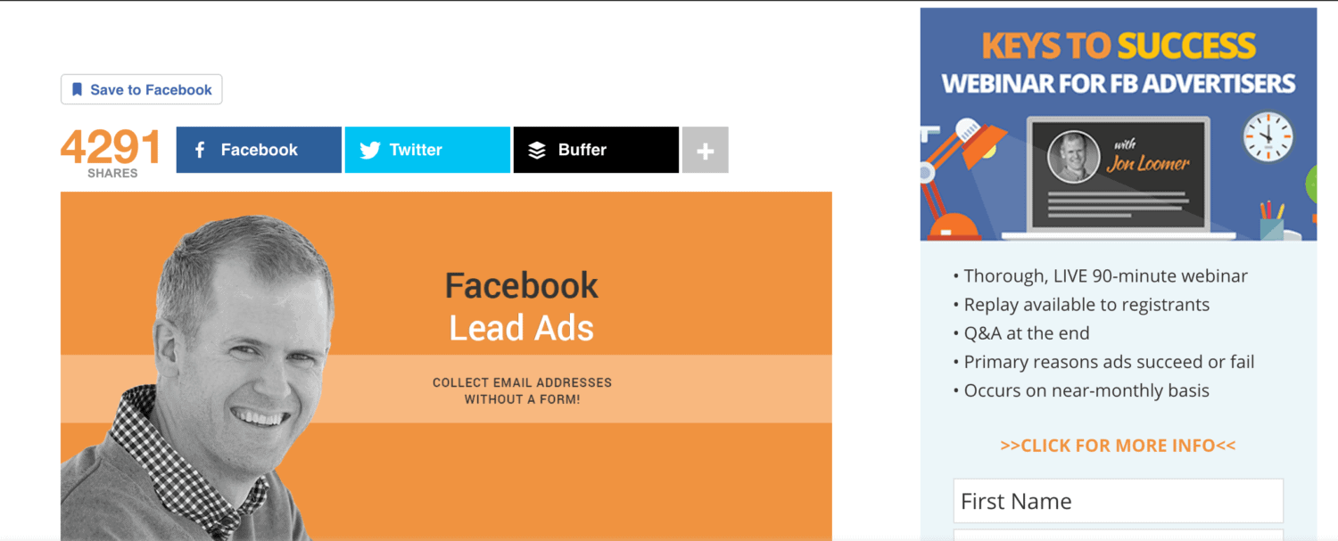
To overcome this barrier, add content that shows your seriousness or positions you as an expert in your field. For example, Venture Harbor uses a contact entry form showing CEO Marcus Taylor leading a digital marketing seminar.

The above form is effective for two main reasons: it positions the CEO as an expert and ensures the credibility of the company. 3 elements reinforce this idea:
- Bullet points promise readers access to studies from reliable sources.
- the photo is taken at a well organised digital marketing conference and is not a photo taken in a meeting room
- The logos of well-known market leaders below provide further proof of the company’s seriousness.
The combination of all these key elements instinctively increases trust. Visitors are therefore more likely to believe the beautiful promise stated in the title.
#6. Reiterate the benefits of your offer
All companies know how to include the benefits of their product or service on their website. However, too few take the time to mention these benefits in other forms of advertising, such as landing pages.
Highlighting and repeating the benefits of your solution is an effective way to inform new customers about what they can expect.
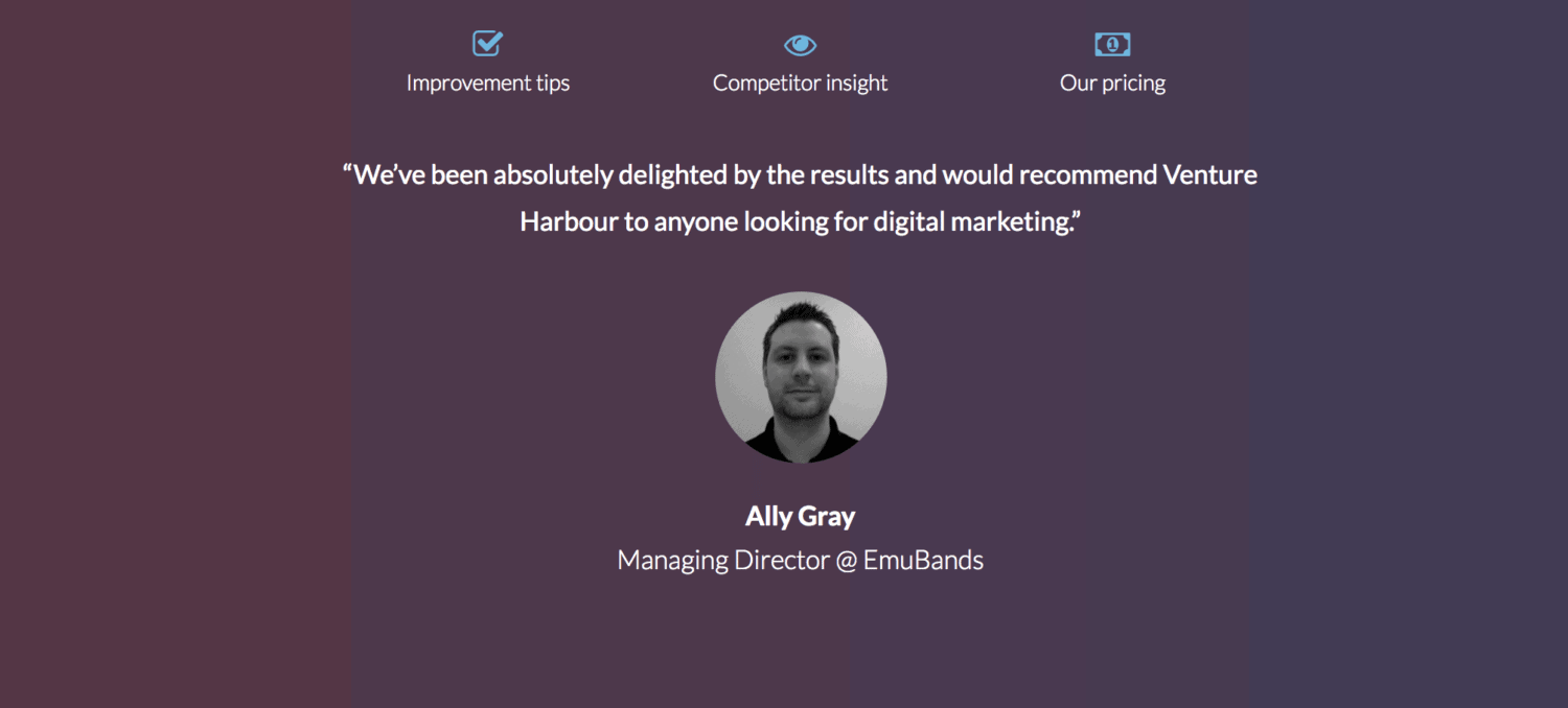
The page above is a good example of repeating the benefits. Here the company uses the testimonial of an existing customer to prove the benefits of the solution mentioned above.
#7. Offer a trial period
Consumers are more willing to hand over their personal data if they have a real intention to buy or if you make them an offer they cannot refuse.
Use buyer intent to your advantage. By offering customers a free trial, you can expect the conversion rate of your form to multiply. There are important reasons for this:
The psychology of a consumer finds it hard to resist anything that is free
Try before you buy is an option that every consumer wants if offered
Free trials prove your confidence that your product is better than the competition
When you offer a free trial, users may abuse your offer. To avoid this problem, limit the trial in time or the number of services you want to sell. You can also counterbalance your offer by asking for more information to better qualify your prospects.
Now back to our original question: how many fields should you include in your form? If you offer a free trial, users will be much more likely to fill out a long form.
More data available means better quality leads. The likelihood that consumers who take advantage of a free trial are actually interested in your product is greater, so the leads you get are more likely to turn into paying users.
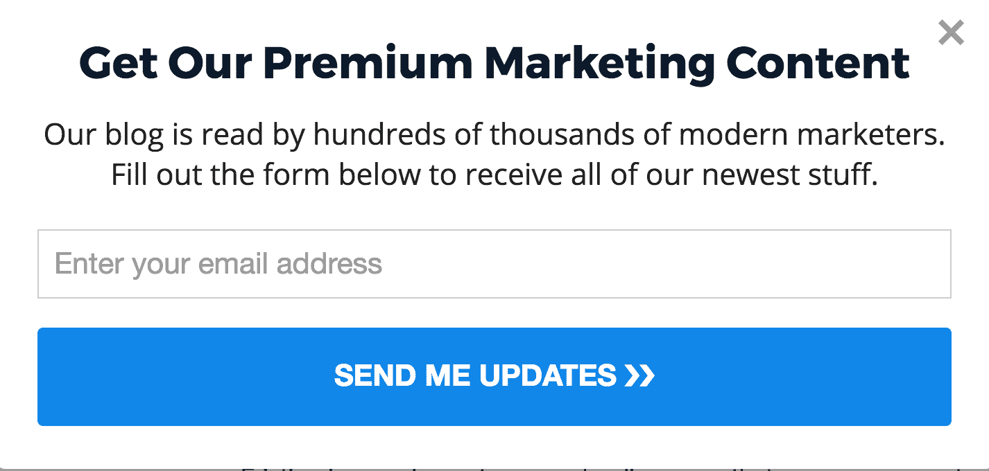
#8. Give a free gift
Not all companies will be able to offer free trials. But that doesn’t mean you can’t attract customers with a small, inexpensive gift. This gift can be anything you want as long as it is relevant and attractive to your visitors.
For example, you may offer content related to your service. You may have written an e-book or white paper related to the search terms visitors use to land on your landing page.
Encourage people to leave their details with you. But also offer them something they can’t get for free anywhere else. Or at least make them believe that they have access to free information that they won’t find elsewhere.
For example, the lead capture above offers readers access to ‘secret’ information. But in reality, the content of the free guide is probably available on every digital marketing blog on the web. What makes the form attractive and makes people want to sign up is the promise of “mastering the basics”.
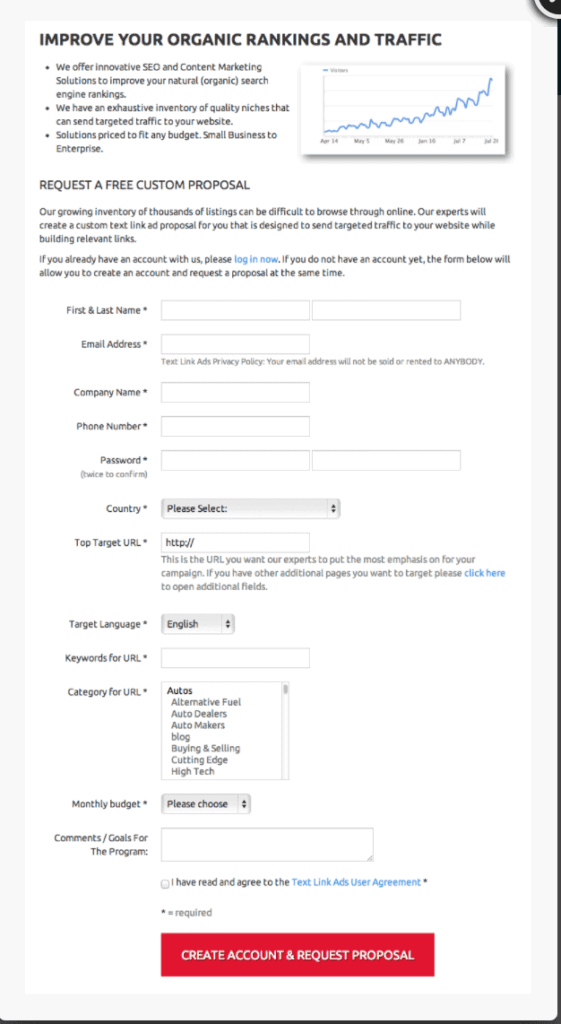
#9. Make your offer visible
The accepted rule of marketing is that you have 8 seconds to get your audience’s attention. In the case of lead collection forms, this statistic is even lower.
If you don’t immediately grab visitors’ attention, they will leave or visit the rest of your site without leaving their details. Therefore, make sure that people can see what you offer at a glance.
Use easily readable bold type that contrasts with the background image. The visuals should also reinforce your offer.
Look at the example below. Here’s what not to do. The most important text – telling customers what they will get for their information – is barely visible.
#10. Don’t forget the privacy policy
With the rise of cybercrime and spam, consumers are reluctant to give brands their email address. It’s not the panacea of all marketing techniques, but adding a privacy policy to your lead collection page goes a long way to building trust.