



- Don’t hide the form at the bottom of the page: most readers never scroll that far.
- A pop-up shown too early annoys people. Trigger it when the visitor is about to leave the site.
- Five fields at most as a general rule, and sometimes an email address is enough.
- Short forms, more leads; long forms, better-quality leads. With a free trial, visitors accept a long form more readily.
- A conference photo, logos of well-known customers, a testimonial: these are what make the headline’s promise credible.
Most website visitors don’t convert. Still, companies can make the most of their web traffic by building sign-up forms that actually work. The design and structure of a lead capture page are central to its success. The purpose of a lead capture form is to collect visitor data you can use later.
To build an effective lead capture page, you can use software such as Leadformly. Forms have to meet two conditions: appeal to the visitor’s emotions and attract the people most likely to become paying users. The other thing to keep in mind is not to harass visitors. The goal of such a form is to let consumers opt into a relationship with your brand easily. This article covers the best practices on the subject.
1. Grab attention
If you’ve had trouble getting your lead capture forms to convert, start by placing them where they will be seen. All too often, marketers put these forms at the bottom of a landing page.
But most readers don’t scroll all the way down, and if your introduction doesn’t invite end users to keep scrolling, your efforts will be wasted.
The placement of a lead capture form is a key factor in the success of your campaign.
Pop-ups are often the go-to option because they are impossible to miss.
The mistake many sites make, though, is showing the pop-up too early. It tends to annoy visitors, who then won’t fill in your form. One of the best options is to trigger it when visitors are about to leave your site, not while they are browsing it.
You can also use an embedded form. The rule of thumb is that the sign-up form sits in a fixed spot on the site, and scrolling the page doesn’t change its position. The best placement is the top right corner or just below your site’s header (menu), which makes the form far less aggressive.
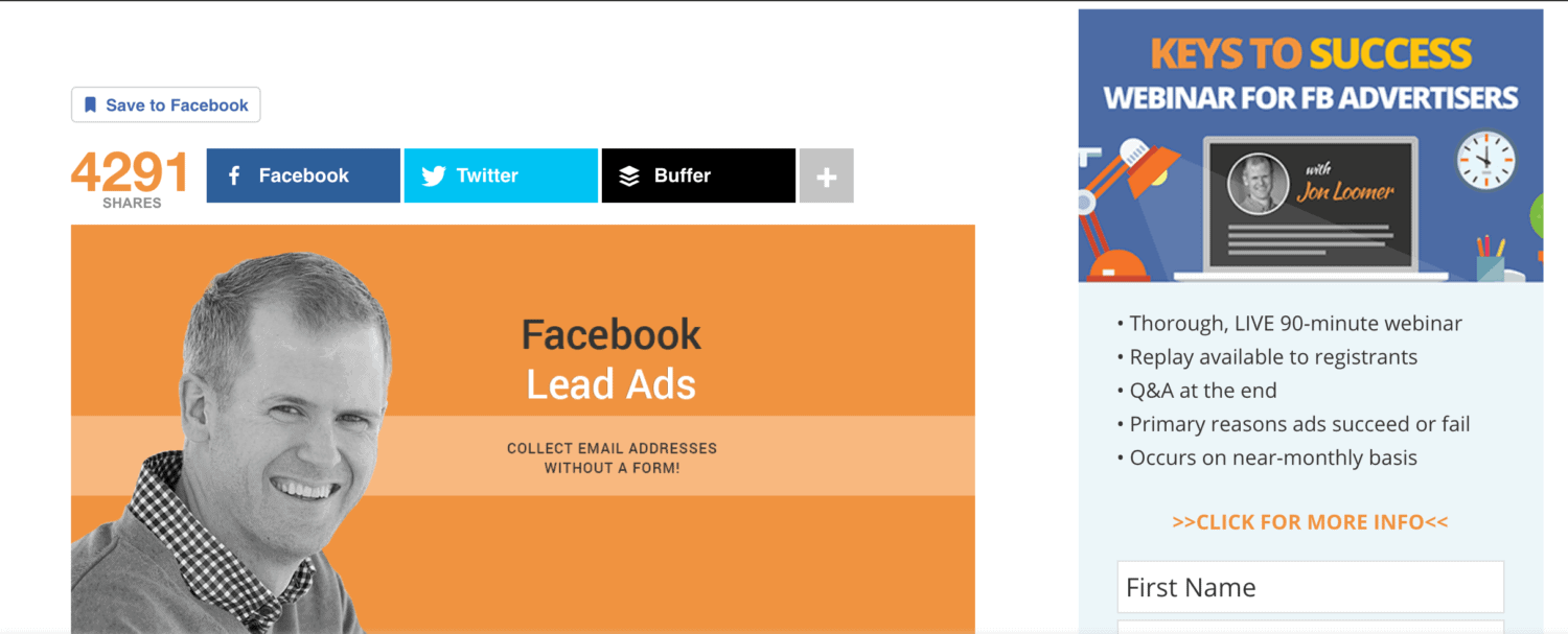
2. Minimize friction
Lead capture forms can be especially disruptive. Website visitors don’t like having their browsing interrupted, which is why more and more of them use ad blockers.
The layout and design of your form will also influence what visitors decide. As a general rule, cap the number of fields at five. Of course, it all depends on how much information you need to collect to reach your campaign goals.
Remember: the fewer fields there are to fill in, the more people are likely to complete your form. This is especially true if you are a small business without strong online recognition. Sometimes all you need is an email address.
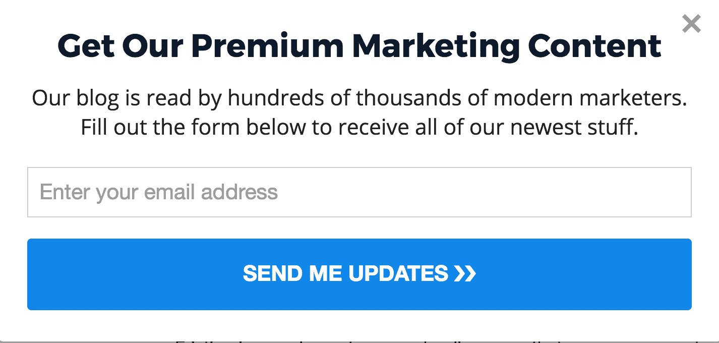
3. Longer form = better-quality lead
When you build a form to collect leads, decide which goals you want to reach.
Still, keep in mind the points above about how intrusive your forms are. Here is the line to remember:
“Short forms will generate more leads, longer forms generate better-quality leads.”
When customers agree to fill in a form with many fields, it means their purchase intent is higher. You still need to strike the right balance between the quality of the information you collect and visitors’ willingness to fill in long forms.
A few things to consider:
- How well known is your company? You’d better have strong appeal if you go for a long form.
- How unique is your product?
- How good is your product compared with your competitors’?
- Do you already have a large enough email base? If your only goal is to build an email list, you can cut the number of fields. If you want to refresh your mailing list with better-quality prospects, build a longer form.
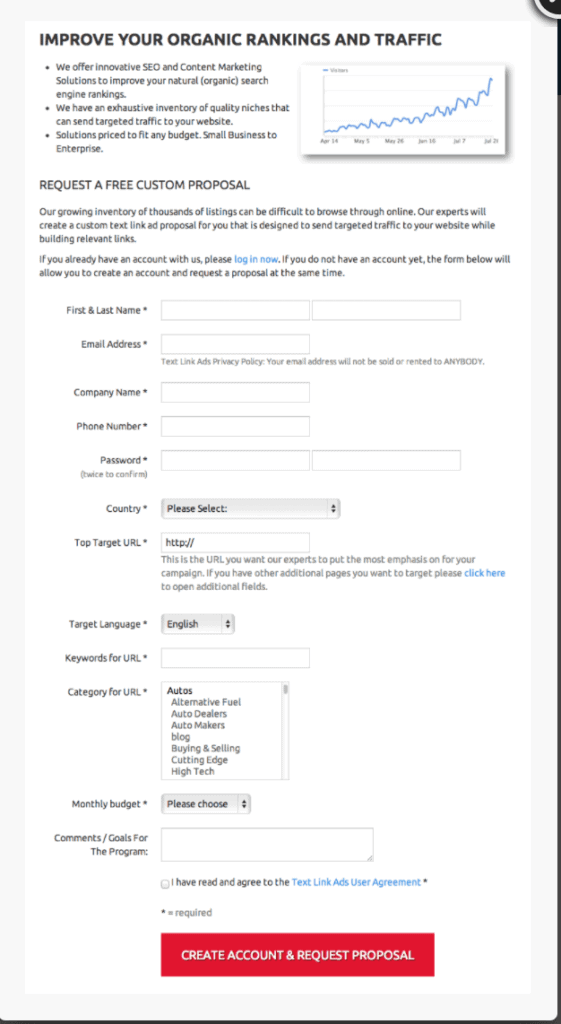
4. Use an informative headline
To capture your visitors’ attention, the quality of your headline makes all the difference. People need to understand right away why they are filling in the form. If the headline doesn’t hook them, you lower your chances of converting them.
There are plenty of ways to write catchy headlines in marketing. But when you write headlines for a lead capture form, get straight to the point. Be concise, effective and precise about your value proposition.
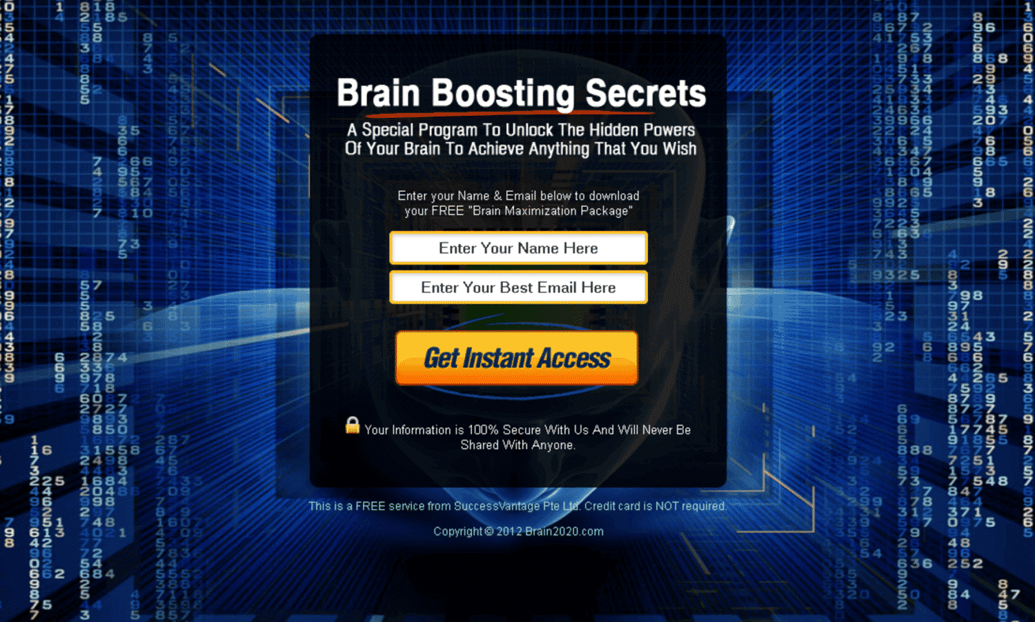
The reason the form above converts so well is that it uses an eye-catching font for the text describing the value of signing up. Just below, the subheading gives readers more information spelling out what they gain by signing up.
5. Build trust and authority
Trust is a major issue for internet users. Online businesses are essentially faceless, and most visitors to your website have never heard of you. So why should they hand over their personal details?
The main problem for advertisers is that the online market is saturated. Far too many brands don’t keep their promises. That is why most consumers no longer trust traditional advertising.
To get past this obstacle, add content that proves you are serious or positions you as an expert in your field. For example, Venture Harbor uses a contact capture form showing CEO Marcus Taylor leading a digital marketing seminar.
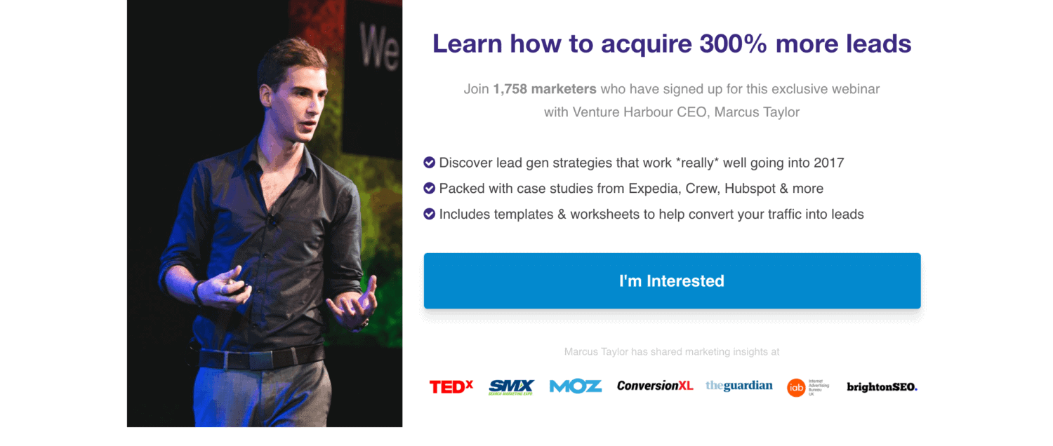
The form above works for two main reasons: it positions the CEO as an expert and establishes the company’s credibility. 3 elements reinforce this:
- the bullet points promise readers access to studies from reliable sources.
- the photo was taken at a well-organized digital marketing conference, not in a meeting room
- the logos of well-known market leaders underneath add further proof that the company is serious.
Combining all these key elements instinctively increases trust. Visitors are therefore more inclined to believe the big promise made in the headline.
6. Repeat the benefits of your offer
Every company knows how to list the benefits of its product or service on its website. But too few take the time to mention those benefits in other forms of advertising, such as landing pages.
Highlighting and repeating the benefits of your solution is an effective way to tell new customers what they can expect from it.
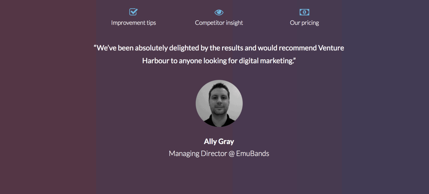
The page above is a good example of repeating benefits. Here, the company uses a testimonial from an existing customer to prove the benefits of the solution listed earlier.
7. Offer a trial period
Consumers are more willing to share their personal data if they genuinely intend to buy or if you make them an offer they can’t refuse.
Use buyer intent to your advantage. By offering customers a free trial, you can expect your form’s conversion rate to multiply. There are solid reasons for this:
- Consumer psychology struggles to resist anything free
- Trying before buying is an option every consumer wants when it’s on the table
- Free trials show your confidence that your product beats the competition
When you offer a free trial, users may abuse it. To avoid this, limit the trial in time or in the number of services you want to sell. You can also balance your offer by asking for more information so you can qualify your prospects better.
Now back to our opening question: how many fields should your form include? If you offer a free trial, users will be far more inclined to fill in a long form.
More data means better-quality prospects. Since consumers who take a free trial are more likely to be genuinely interested in your product, the prospects you get are more likely to turn into paying users.
8. Offer a free gift
Not every company will be able to offer free trials. But that doesn’t mean you can’t attract customers with a small, inexpensive gift. The gift can be anything you like, as long as it is relevant and appealing to your visitors.
For example, you can offer content related to your service. Maybe you’ve written an ebook or a white paper tied to the search terms visitors used to land on your page.
Encourage people to leave their contact details. But also give them something they can’t get for free anywhere else. Or at least, make them believe they are getting free information they won’t find elsewhere.
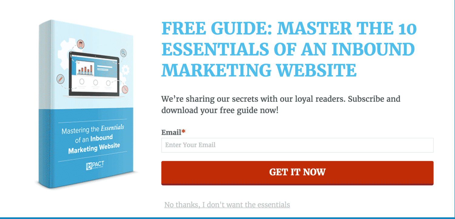
For example, the lead capture above offers readers access to “secret” information. In reality, the content of the free guide is probably available on every digital marketing blog on the web. What makes the form appealing and makes people want to sign up is the promise to “master the essentials”.
9. Make your offer visible
The accepted rule in marketing is that you have 8 seconds to grab your audience’s attention. For lead capture forms, that figure is even lower.
If you don’t catch visitors’ attention immediately, they will leave or browse the rest of your site without leaving their details. So make sure people can see what you are offering at a single glance.
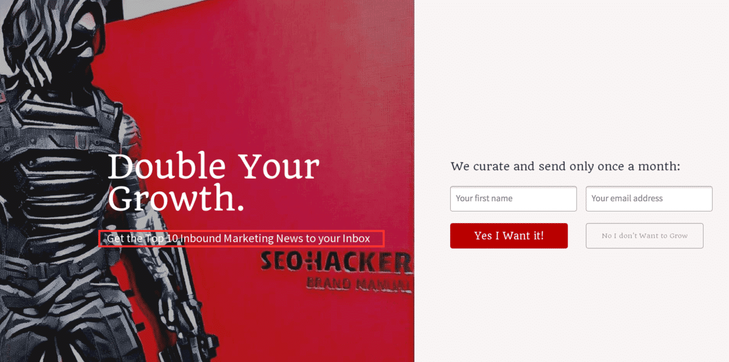
Use bold, easy-to-read type that stands out against the background image. Visuals should also reinforce your offer.
Look at the example below. This is what not to do. The most important text – telling customers what they get in exchange for their information – is barely visible.
10. Don’t forget the privacy policy
With the rise of cybercrime and spam, consumers are wary of giving brands their email address. It isn’t a cure-all among marketing techniques, but adding a privacy policy to your lead capture page goes a long way toward building trust.
The questions we get over and over.
Where should you place a lead capture form?
Where it will be seen, not at the bottom of the landing page. A pop-up is impossible to miss, but it annoys people if it appears too early: it’s better to trigger it when the visitor is about to leave the site. An embedded form goes in a fixed spot, in the top right corner or just below the menu.
Should a lead capture form be short or long?
Short forms generate more leads, long forms better-quality leads. A visitor who agrees to fill in many fields has higher purchase intent. As a general rule, stick to five fields, and lengthen the form if your company is well known or if you offer a free trial.
How do you build trust on a lead capture landing page?
By adding content that proves you are serious or positions you as an expert: a photo of the CEO at a conference, logos of well-known companies, a testimonial from an existing customer, and a privacy policy.
What should you offer in exchange for the visitor’s contact details?
A free trial, limited in time or in number of services to prevent abuse. Failing that, a small relevant gift, such as an ebook or a white paper tied to the searches that brought the visitor to the page.


What the community says.