The sales dashboard serves several purposes:
- The first is most often referred to as visual management. It allows everyone on the sales team (and even on other teams) to have clear visibility into the status of performance and goal completion. It makes it much easier to align teams with the company’s objectives and to communicate very clearly about the issues.
- The second most commonly mentioned objective by sales managers is gamification. The leaderboard updated in real time throughout the day, ad hoc missions and objectives, etc. The sales dashboard is a powerful way to communicate all these elements and to animate a stage.
- The latter is less about the dashboard itself and more about accessing the underlying data, with a data visualization tool that is advanced enough to allow for more complex analysis. The dashboard is the visible part of a fundamental work that consists in exposing all the data of the company.
Sommaire
Which KPIs should you choose for your business dashboard?
The most important issue in choosing the most appropriate KPI is to think about the audience you are addressing and the objective you want to achieve (visual management, gamification, access to data). The choice of KPI will vary depending on the assignment and the reporting relationship of the recipient. An operational or strategic insight can be provided depending on the chosen KPI.
For example, if the objective is to have a strategic insight, the choice of KPI should be based on indicators related to the customer satisfaction rate by product or sector, the ratio between the realized margin and the expected margin, or the share of each product in the global turnover.
For a more operational approach and short and medium term objectives, the choice can be made according to the following criteria: conversion rate, re-purchase and retention rate, turnover, failure and sales rate, etc.
Very concretely, for C-level executives, a KPI that allows them to have a 360° view of everything related to customer relations will be the most adapted to their needs, without reaching a precise level of detail. For a sales department, the goal is to track employee performance and accurate sales forecasts to monitor the sales pipeline and be able to prioritize the most relevant opportunities.
How to build a successful business dashboard?
The best way to design a dashboard is to keep in mind who the audience is. It is also necessary to take into account the level of expertise and to calibrate the topics and data in the most appropriate way. Beginners will obviously have different needs than more experienced users.
For a better overall readability, limit the number of views to two or three. If you want to expand the scope, it is better to create more dashboards or to use a story, i.e. a sequence of visualizations that work together to guide the user through the information. Also make sure to have a limited number of colors to avoid visual overload that prevents a correct analysis for users.
After you have completed the initial design work, turn your attention to the tooltips. They are a great opportunity to reinforce the story you are trying to tell with your dashboard. You can easily customize them to suit your goals.
In short, each element of your dashboard should have a purpose. If you feel that it is too busy, don’t hesitate to remove elements, adopt a new organization or opt for a floating layout. This will allow you to give a specific fixed size to your dashboard even if the window size changes.
8 examples of business dashboards
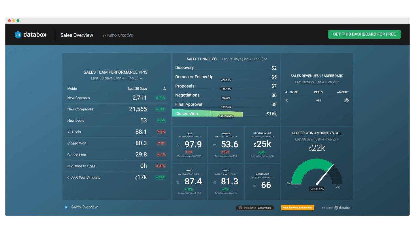
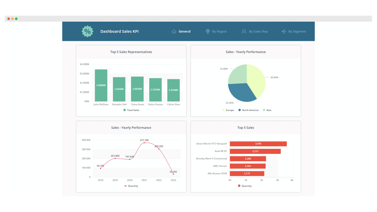
#1 The control panel
(Clicdata)
A business dashboard can take the form of a control panel that provides profitability and revenue reports. It provides key information on sales performance. It allows you to clearly identify where you should focus your sales and marketing efforts.
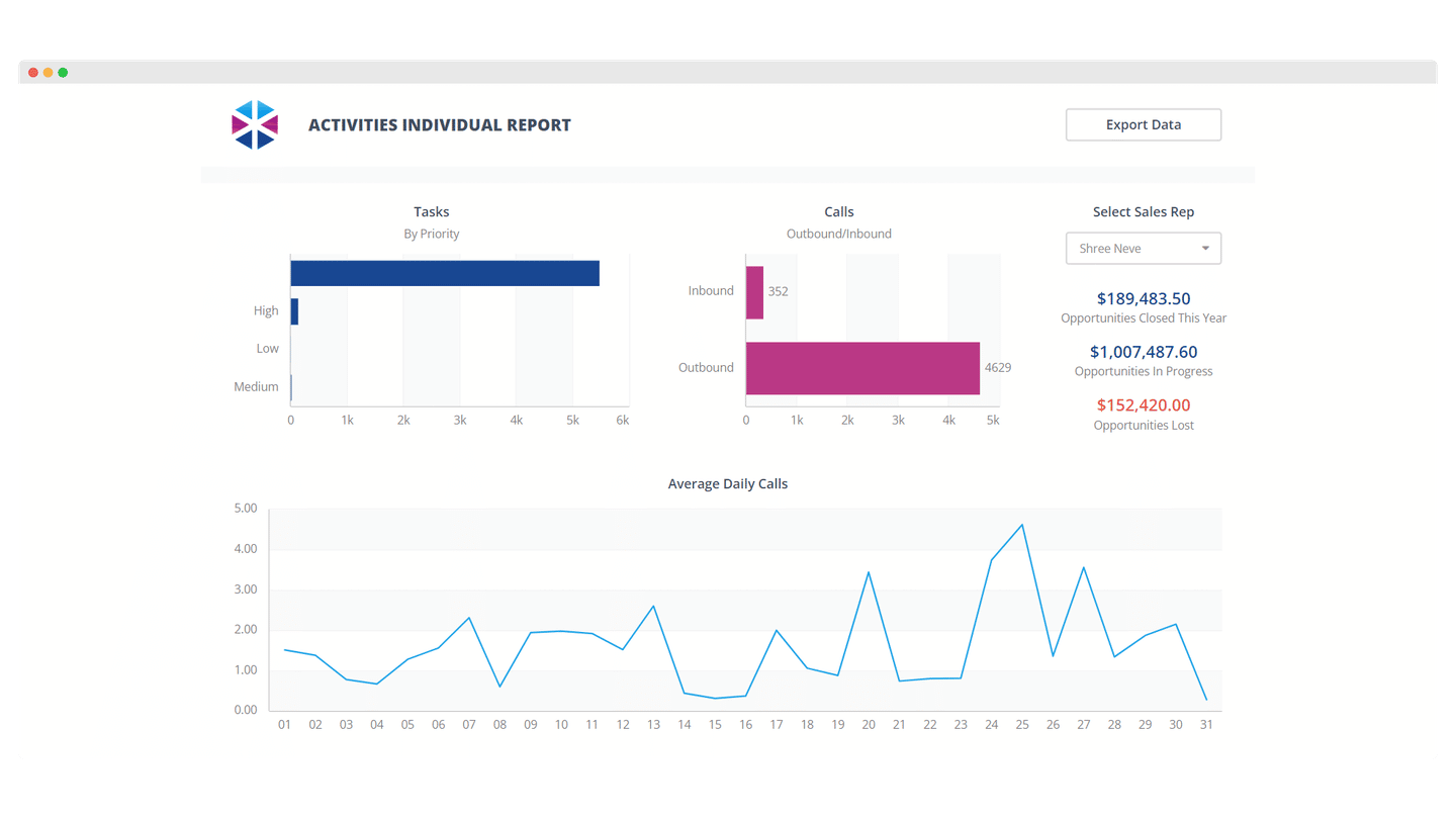
#2 The Business Activity Tracking Chart
The sales activity tracking table allows you to enter tasks: calls to be made, number of emails to be sent or leads to be contacted, etc.
It’s a dashboard that is much closer to the operational teams and allows them to follow the business activities very closely so that the team can react quickly if the funnel is not moving as it should.
Often, this dashboard is broken down into several individual reports. It allows you to track the individual business activities of each team member.
#3 The leaderboard: motivational engine and gamification
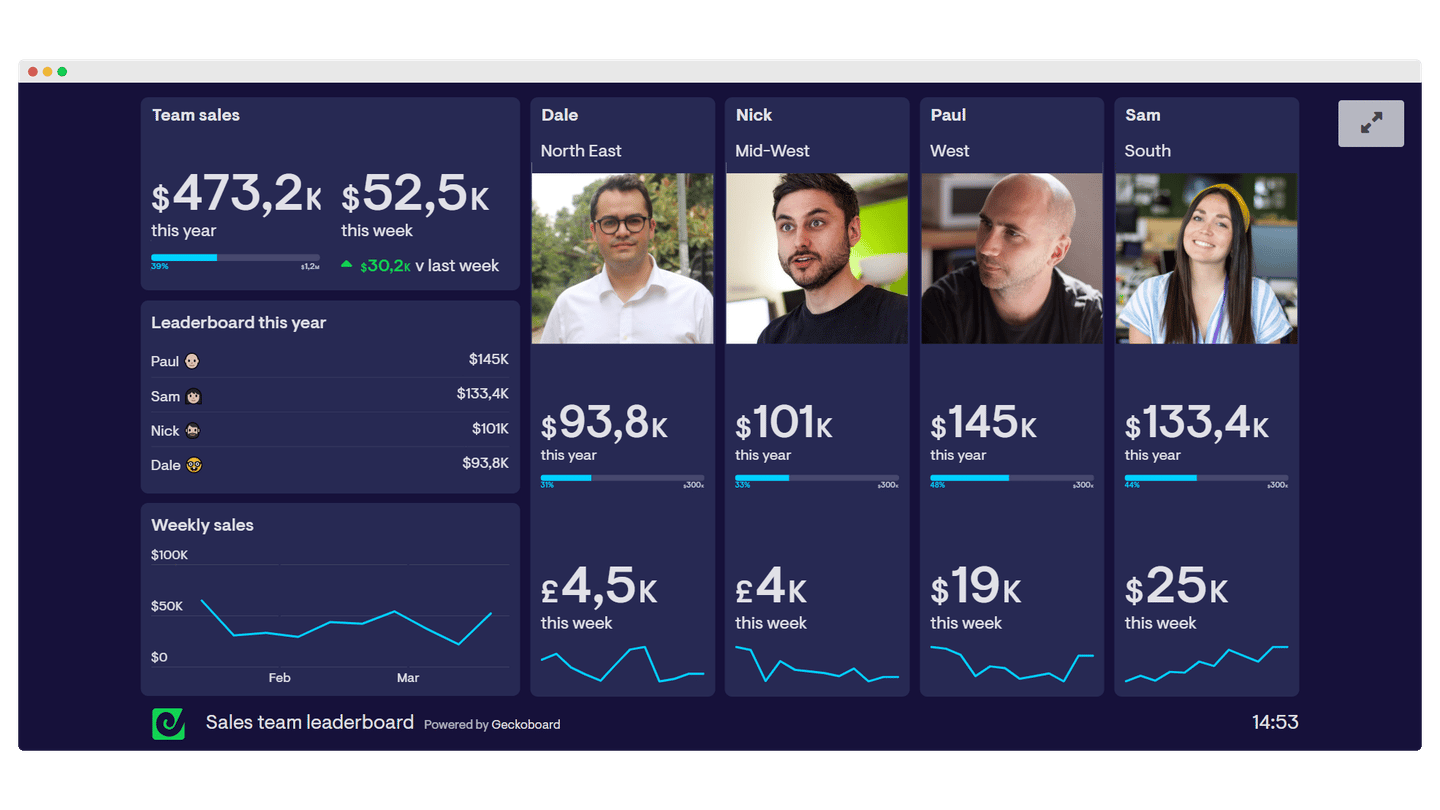
The leaderboard provides a real-time update of all the contests you run in a sales team. It’s a great way to motivate your team and let everyone know what to do.
The leaderboard can also be built by team to avoid too much internal competition and encourage mutual support, especially if you have a lot of recruits.
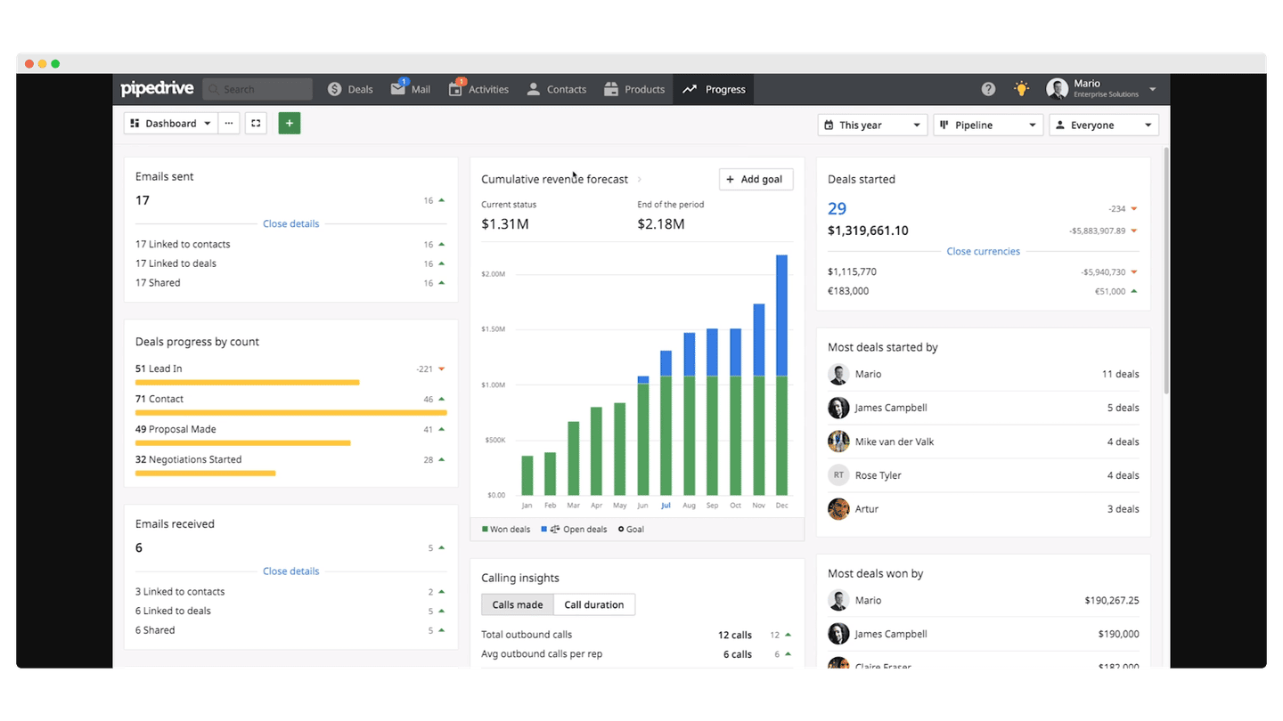
#4 The forecasting dashboard
The purpose of the forecast dashboard is to show the status of the sales pipeline.
#5 The Marketing ROI Dashboard
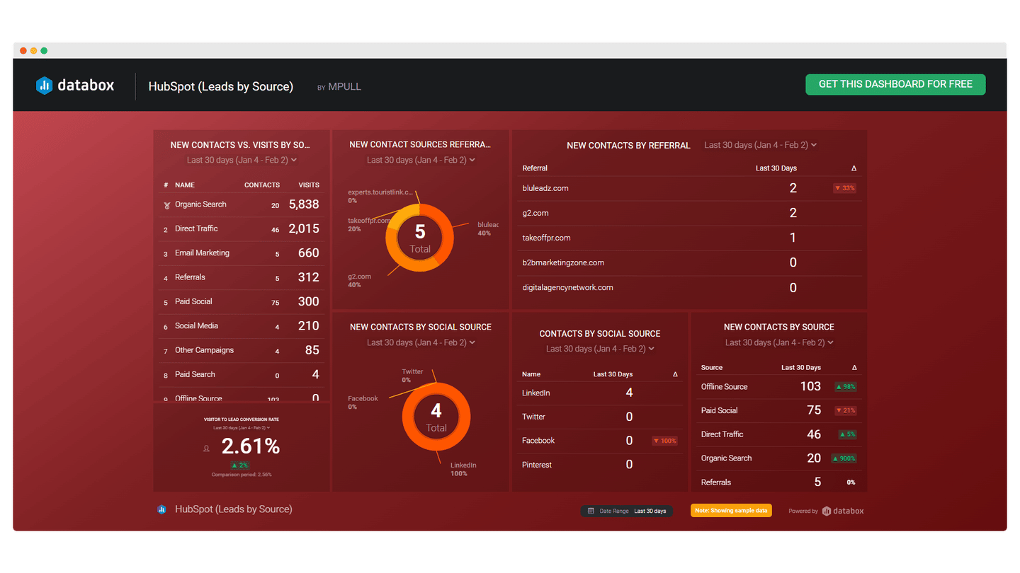
(Databox)
The big challenge of this last dashboard is above all to better align the sales and marketing teams. And again, putting shared KPIs on a visible and accessible dashboard really gets things moving.
Which tools to build a business dashboard?
#1 Your CRM software
CRM software offers dashboarding features that are very useful to build your dashboard. Most of the software programs give you access to the chronology of your customers’ activity, which allows you to easily manage your sales and your interactions with your customers. Sales reports track numbers, such as new business or recurring revenue. In most cases, these solutions are very complete but not well used by their users.
Go further
#2 Geckoboard
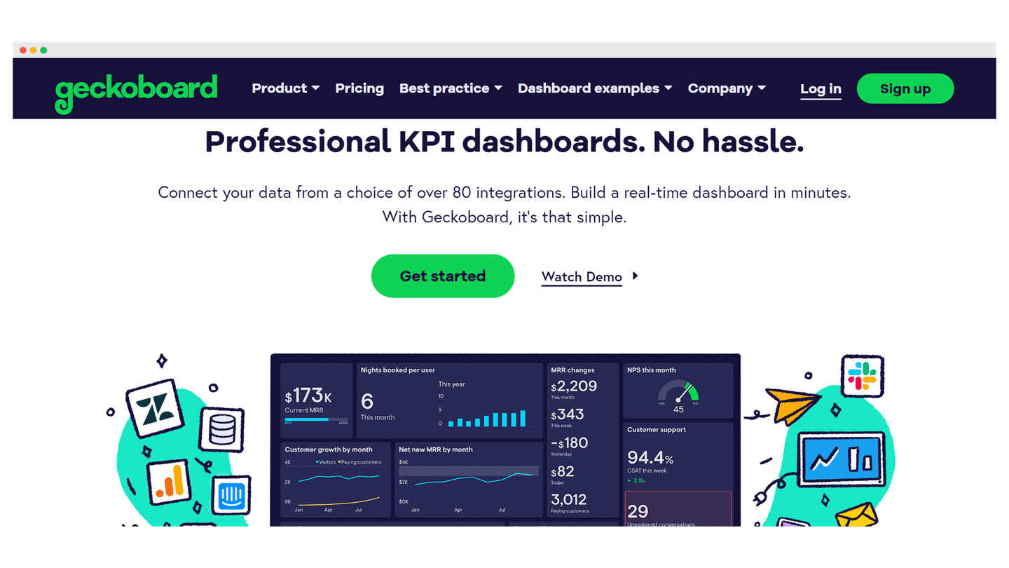
Geckoboard is an interactive and easy-to-use data analysis and dashboarding tool. It helps companies collect and visualize their key sales performance indicators with real-time sales dashboards.
The software allows you to use data from more than 80 data sources and to enter data using spreadsheets, Zapier or custom APIs. It also has a drag and drop editor that allows you to quickly customize your dashboard and add the widgets you want.
Geckboard offers a 14-day free trial with access to all features to get a good idea of the tool’s capabilities.
#3 Datapine
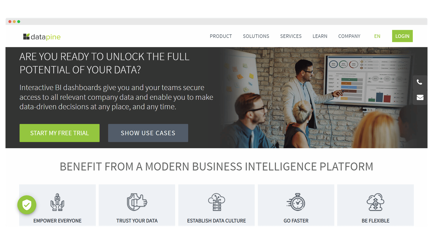
Datapine is an all-in-one BI and dashboard software that allows anyone to create interactive dashboards, generate actionable insights and make effective decisions.
It is a software that adapts to any type of business. It offers an extensive gallery of more than 80 predefined dashboard templates and numerous chart types to facilitate the creation of dashboards.
It has a drag-and-drop editor that allows you to quickly customize your templates and create custom dashboards. A predictive analysis engine gives you insight into future sales trends.
Datapine offers a 14-day free trial to give you a good idea of the tool’s capabilities.
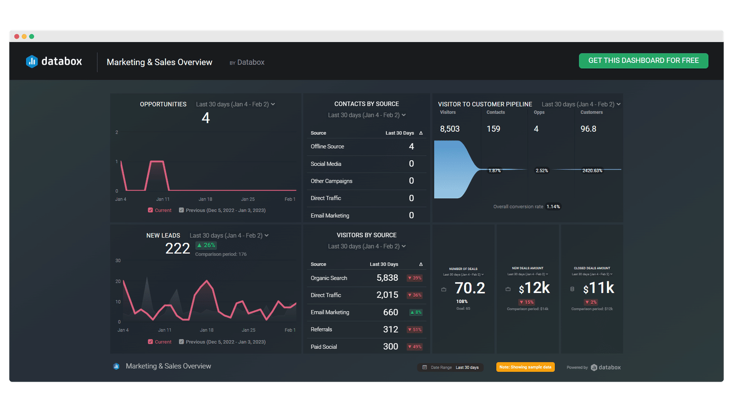
#4 Databox
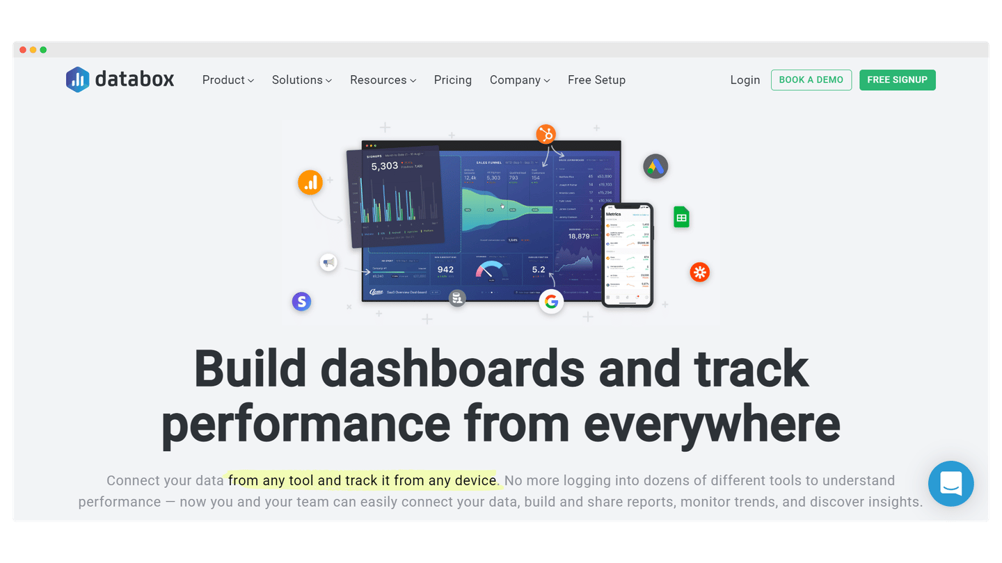
Databox is an easy-to-use dashboarding software that simplifies your sales processes. It brings all your sales data together in one place and allows you to monitor and present the data via your dashboards, all in real time.
Databox offers over 70 integrations and over 200 predefined dashboard templates to quickly collect and visualize your data. You can easily customize them with the built-in drag-and-drop dashboard designer.
The software also allows you to receive notifications about KPI trends via email, push notification or Slack.
Databox offers a free trial to give you a good idea of the tool’s possibilities.
#5 Klipfolio
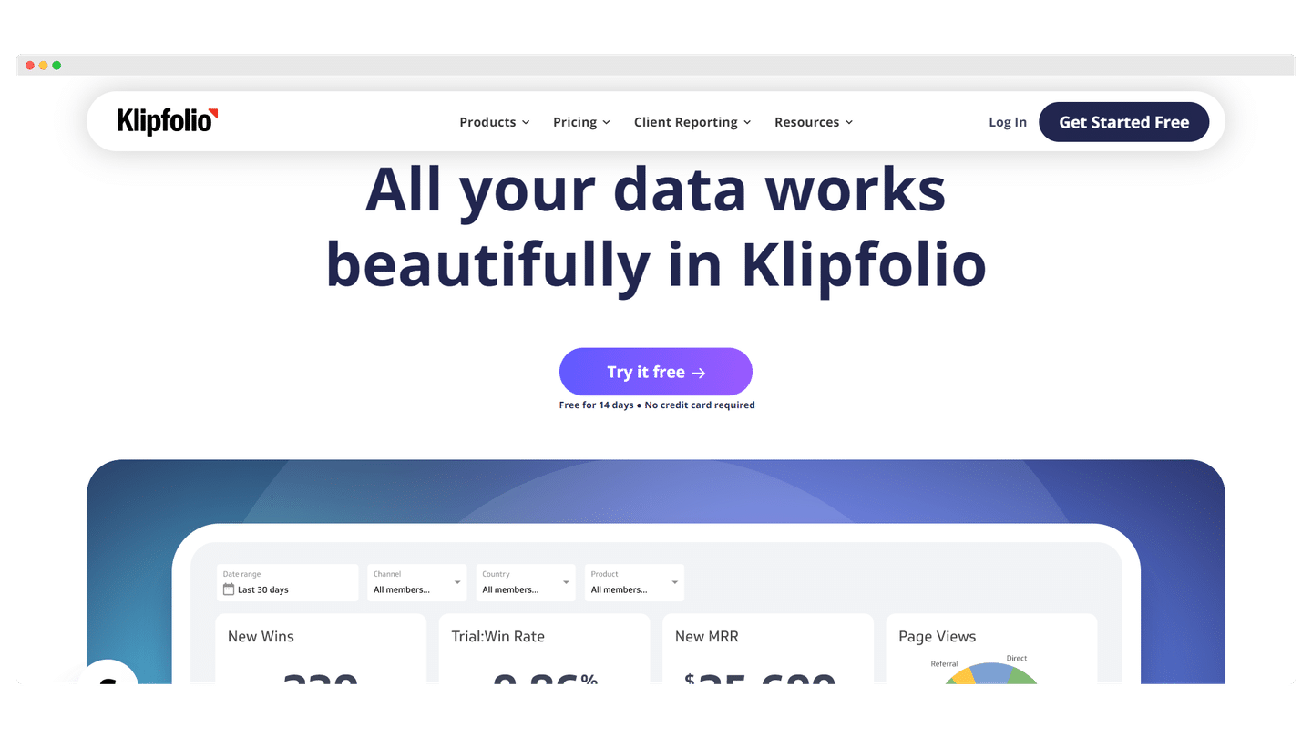
Klipfolio is a low-code software that allows you to create dashboards and centralize your data. It can be adapted to all sectors of activity but is particularly appreciated by medium and large companies that have a dedicated sales department and specific needs.
Klipfolio offers over 300 integrations and also allows for manual data entry. It has a large library of formulas that are very efficient for sorting your data in minutes. Klipfolio provides over 30 predefined chart types to visualize your data and allows you to quickly customize your dashboard.
Klipfolio offers a 14-day free trial with access to all the features to give you a good idea of the tool’s possibilities.
#6 Scoro

Scoro is a dashboarding software that provides a real-time overview of your sales pipeline, leads, deals, and team activities in one place, and allows you to make data-driven decisions to boost your sales.
Scoro allows you to compare multiple budget scenarios to actual revenues, costs and profits and receive forecasts based on scheduled invoices.
With powerful reporting capabilities, you can also track performance and key performance indicators and identify challenges and opportunities with real-time information.
Scoro offers a 14-day free trial with access to all features to give you a good idea of the tool’s capabilities.
#7 Looker
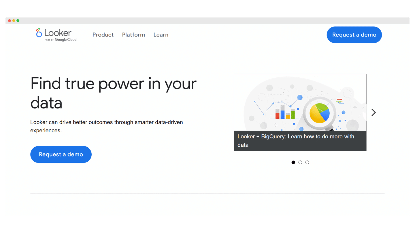
Looker is a BI and analytics software that helps companies collect, monitor and visualize real-time sales information via interactive dashboards. It is a very easy to use software that is perfectly suited for those who are looking for a simple but complete solution.
Looker makes it easy to integrate data from databases such as BigQuery, Snowflake and over 50 SQL dialects. Looker’s mobile application provides instant access to dashboards or monitoring of key performance indicators. Looker also offers a predictive analysis engine.
Looker offers a free trial to give you a good idea of the tool’s capabilities.
#8 Datapad
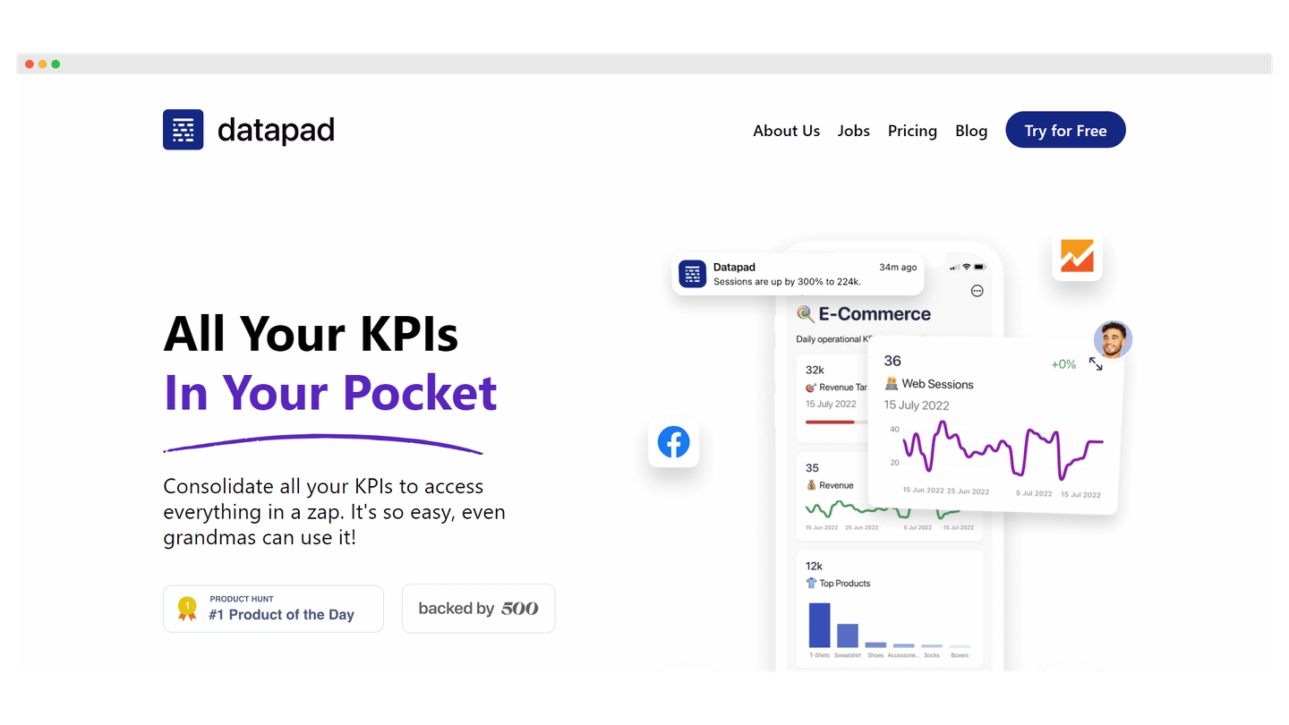
Datapad is the industry’s first mobile-only KPI tracking and dashboarding software. It gives you instant access to your sales KPI dashboard directly from your smartphone.
It is a code-free software perfectly suited for those who are just starting out but want to measure the sales performance of their business. It is a fast and compact tool that offers many features and allows its users to perform all the actions that can be done on a classic computer dashboard.
You can easily view and customize your dashboard on your smartphone. Datapad also offers one-click integrations to many databases such as MySQL, Google Sheets, Google Analytics, etc. Manual data integration is also possible.
Datapad also enables real-time collaboration with your sales team. It offers intuitive drag-and-drop customization options and many predefined data visualization elements (charts, tables, graphs, etc.).
Datapad offers a 14-day free trial with access to all features to get a good idea of the tool’s capabilities.
#9 Qlik Sense

Qlik Sense is an advanced business and sales analytics tool that enables companies to boost productivity, increase revenue and reduce risk more effectively.
It offers an interesting functionality of product performance analysis. It allows you to develop more effective strategies to seize sales opportunities. You can also receive PDF dashboards to receive individual analyses.
Qlik Sense offers a free 30-day trial with access to all features to get a good idea of the tool’s capabilities.
#10 Google Data Studio

Google Data Studio is a visualization tool that allows you to create interactive dashboards and beautiful custom reports. It can analyze raw data from over 800 datasets. It is a tool that is widely used by marketing teams and agencies. If you want to cross-reference marketing and sales data, Google Data Studio is an interesting solution.
You can work on the same dashboard with your sales team in real time. Google Data Studio also allows you to integrate your dashboards into various media (emails, blogs, etc.). You can also prevent others from printing, downloading or copying your dashboards.
Google Data Studio is also interesting for the transformation of your data. You can create new measures based on unique formulas, apply arithmetic or comparison operators or other more sophisticated functions.
Google Data Studio is completely free, take advantage of it!