B2B products and services can be difficult to present cleanly on a landing page. You are often dealing with a longer sales cycle, multiple different decision makers and a complex offering.
But there are good B2B landing pages. And the most successful examples are not just pretty to look at – they also highlight three super important principles:
- 1. Present your offer accurately and clearly.
- 2. Respond to the right intention, or intentions if they can be multiple.
- 3. Personalise as much as possible to get the right message across.
To help you better understand what makes a high-converting B2B landing page, we’ve immersed ourselves in dozens of analyses, and have selected the 23 best landing page examples for this article.
Sommaire
#1 Intercom: create links to other pages
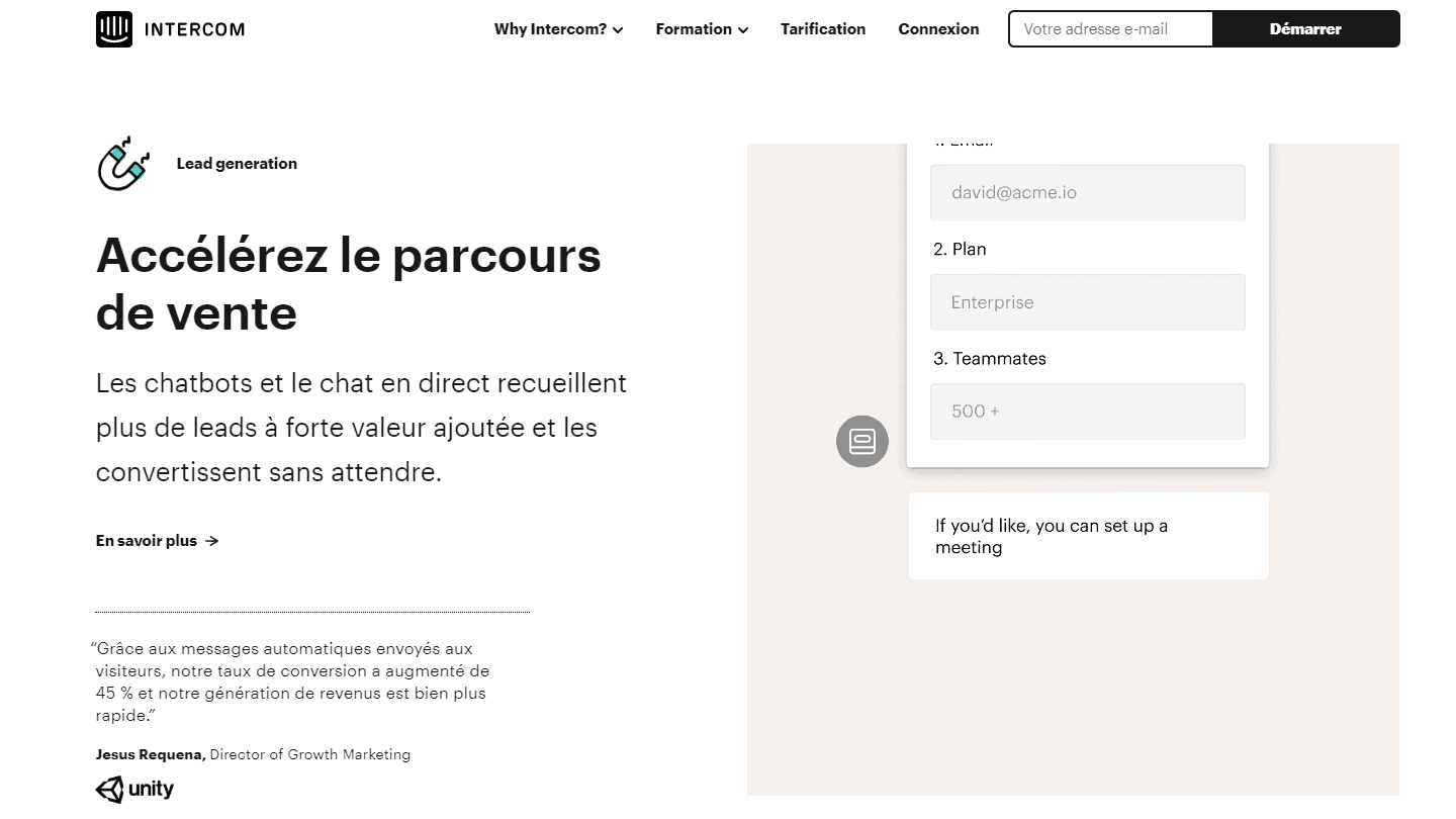
As a rule, linking your landing page to other pages on your website is not a good idea. You want to keep visitors focused on one CTA so they are more likely to convert. But in B2B, people sometimes need more details before they decide to buy.
Take this example from Intercom. The main CTA (call to action) is to start your free trial, but the page also gives visitors the opportunity to learn more about how they can use the platform to acquire, engage and support customers. Each of these buttons takes you to a different section of their website, with more details on those use cases.
Thus, the page itself functions as an offer for people who want to get started immediately, and as a route to explore for visitors who want more information before converting.
As a bonus, it helps your SEO and Adwords quality score.
#2 Shopify: Make the first step as easy as possible
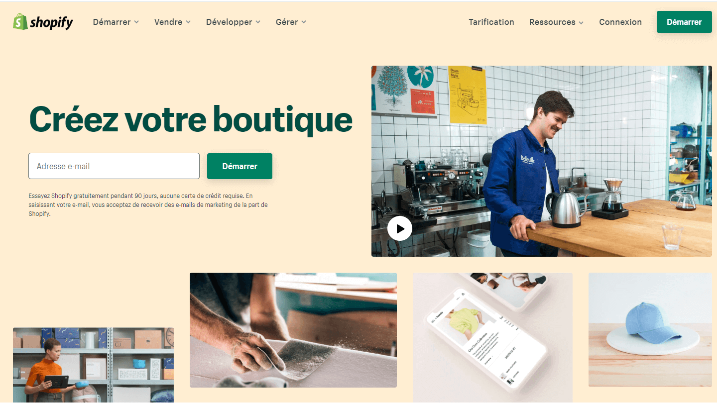
When qualifying B2B prospects, it can be tempting to ask them all the questions your sales team would like to know. “What is your name? What is your phone number? How big is your company?” That’s enough to make anyone want to leave.
This example from Shopify proves that rather than scare people with a series of questions on the homepage, they make it easy to get started with a free trial. All you have to do is enter your email address.
If reducing the number of fields on the form makes you nervous, remember that you will still have time to gather more information from your prospects later in the sales process. This landing page gets your foot in the door.
#3 B2B Quotes: Be specific
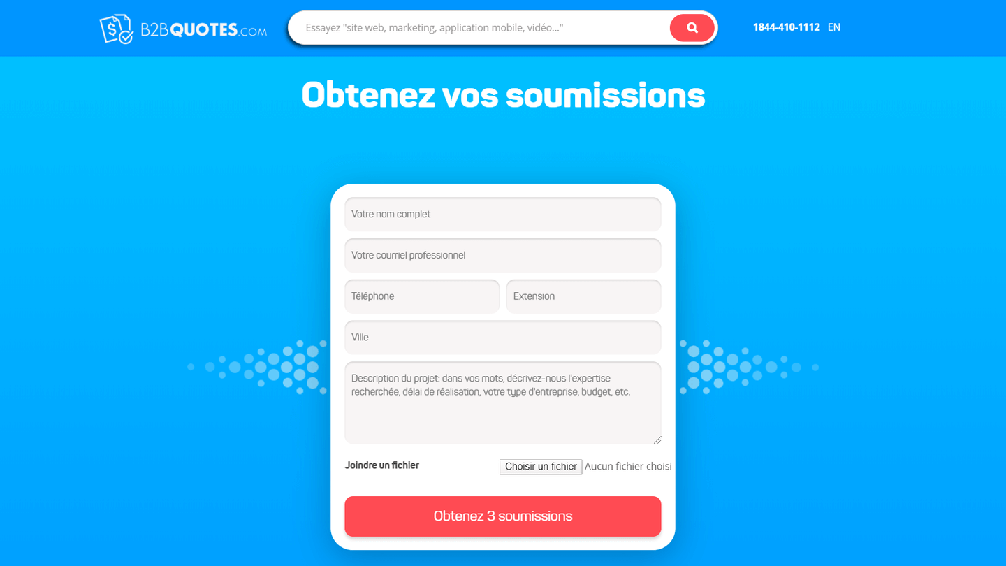
Many B2B landing pages have exactly the same generic CTAs. The “Get Started”, “Start Your Free Trial” and “Request a Quote” buttons are among the most popular. And while they sometimes work well, they are not always the best solution.
This example from B2B Quotes shows how you can be more specific with your CTA to persuade more people to convert. The top form asks visitors to fill in personal information about what they are looking for, and then ends with a button: “Get 3 quotes”.
It’s so simple, yet so powerful – by being specific about the number of quotes, the page sets expectations well. If the form simply said “Submit” (another super common CTA on B2B landing pages), visitors would have no idea what they would get when they clicked that button. And if visitors don’t know what they’ll get next, they have less reason to go further.
Moral of the story: Optimise your call to actions to match the promise as closely as possible.
#4 Singular: Provide different CTAs
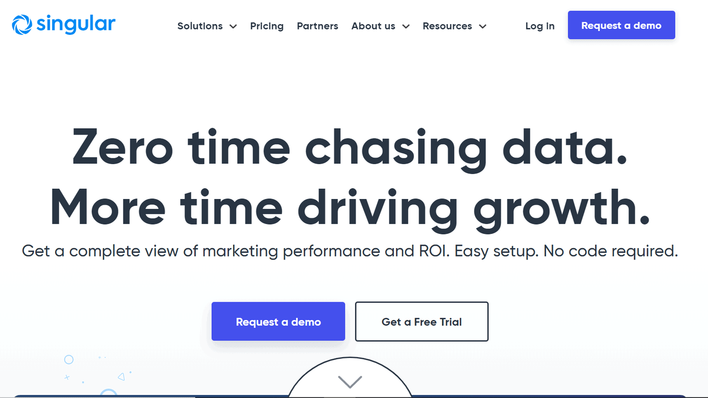
Some gurus still insist that you must limit the number of possible exits on landing pages at all costs – as if the visitor will decide to convert because you have given him no other option.
In reality, it is all about being in tune with the buying cycle. If your visitor is ready to convert, he will convert. And if not, they will look for another way out, or they will leave. That’s a shame.
In the majority of cases, we manage to align the call to action with the intention of a keyword or a set of keywords in a fairly precise way. But there are keywords that are “multi-intentional”. In general, these are the most generic keywords (in exact match). Type landing page on google for example, and you will get very different organic results, reflecting very different intentions:
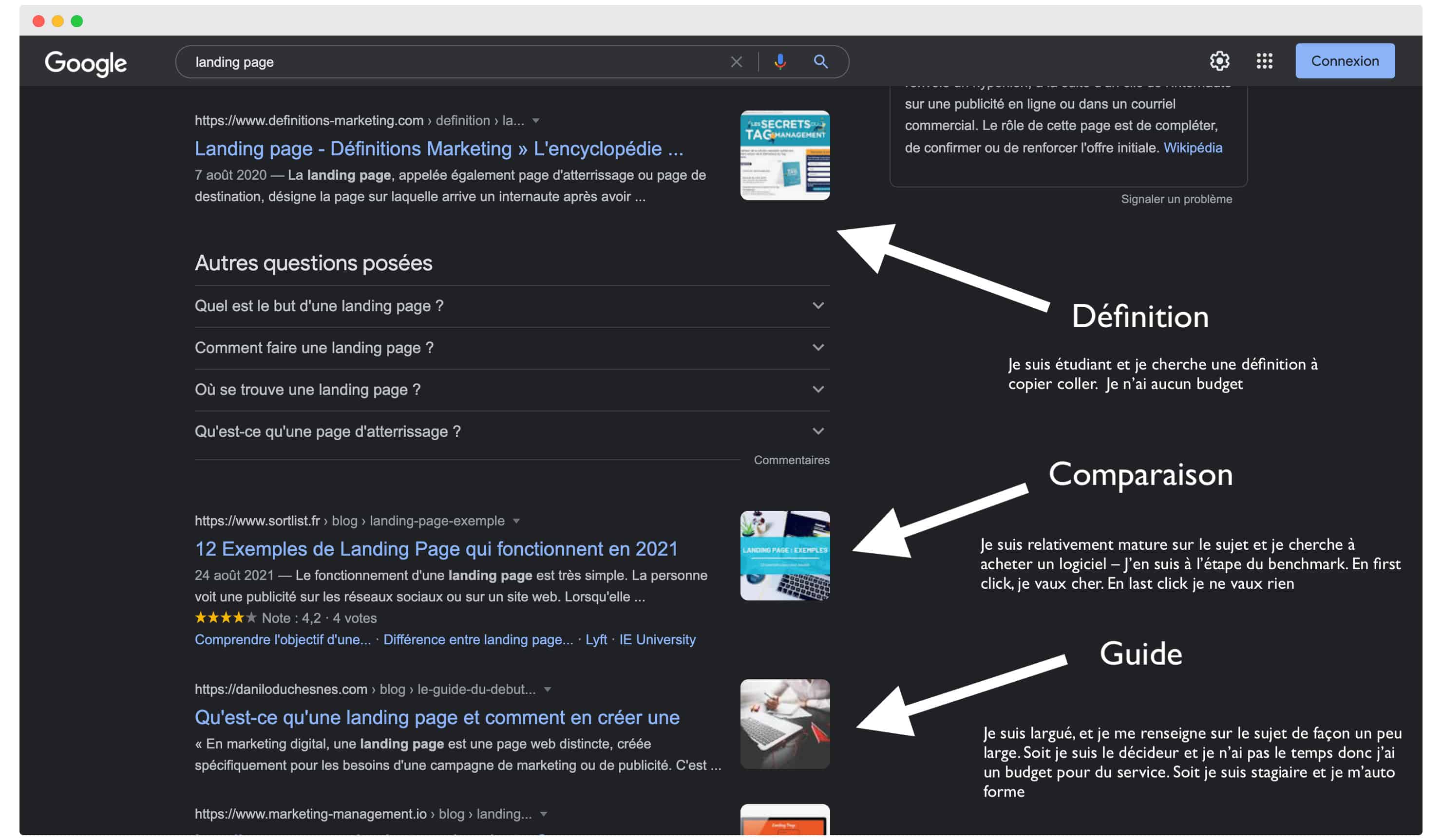
If you’re aiming for vague intentions like this, visitors who click on your page may be at different stages of awareness (and looking to take different steps in their buyer’s journey). They may even be looking for radically different things. A tool, or a service, for example.
That’s exactly why this example from Singular offers a primary CTA to enter your email address and “Create your free account” – but it also includes a secondary CTA for visitors who aren’t yet ready to sign up for “Request a demo”. Giving visitors this choice helps them expand their reach.
- Discover our selection of the
#5 Thinkific: Show visitors the benefits of your solution
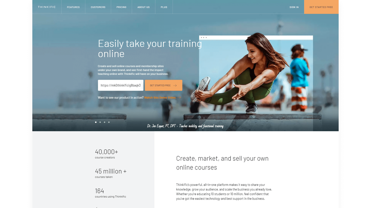
This is a nice homepage from Thinkific, but I’d like to draw your attention to one element in particular. About halfway down the page, they’ve included an interactive tool with the title, “Here’s what you could win with Thinkific.”
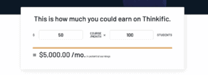
This tool on the page includes two fields that you can adjust: how much you expect to charge per online course, and how many students you expect to have. This is a very clever way to help visitors visualise their future success with the platform and makes signing up for a 30-day trial seem like an easy decision.
#6 iPro Academy: Address your targets directly
iPro Academy is an online university that delivers courses about website creation and digital marketing. As digital marketing is an issue for more and more people today, their dynamic title shows successively the different targets. Here we have “hobbyist”, then the text changes to show: “online entrepreneurs” and then other targets.
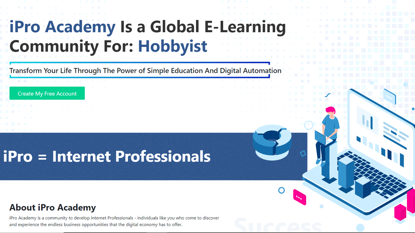
The page is very minimalist but the text is effective, the form (which is reduced to a single field) and the CTA are particularly well placed, and the mockup is well done. If the offer you want to make to generate your B2B leads is really worthwhile, creating a minimalist landing page like this one can be enough to convert a large volume of leads.
Learn how to generate B2B leads with our comprehensive guide on the subject.
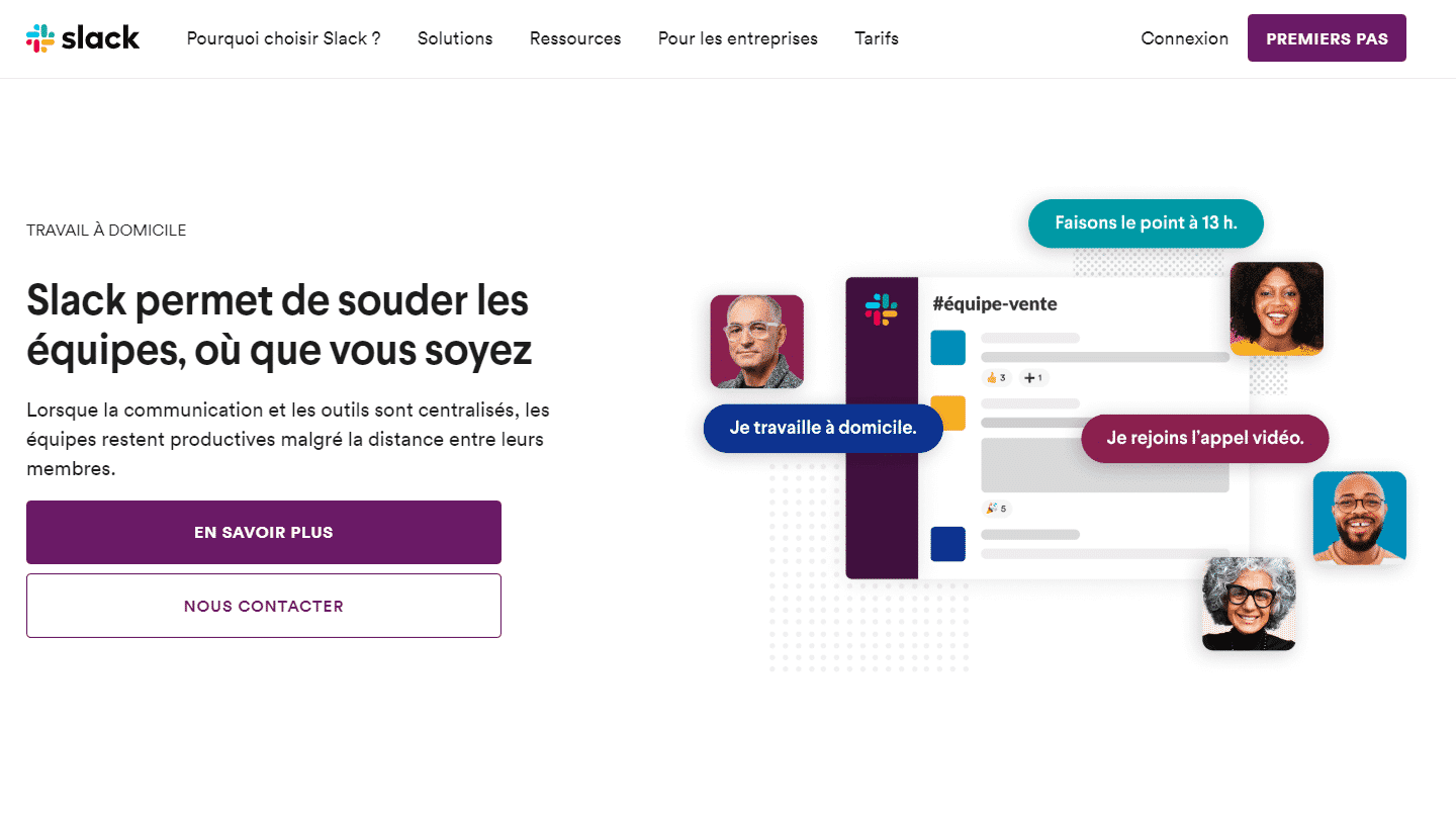
#7 Slack: Showcase your positioning
Most people think of Slack as a business discussion platform. This example shows how you can use your landing to literally change the way people think about your product or service.
The page describes the Slack platform as a “collaboration hub” where you can “create a channel for every conversation” and “quickly find what you need”. In just a few minutes, the page changes your opinion of Slack and makes a compelling case for why your business needs it.
#8 Unbounce: Test several variants
Unbounce is one of the leading landing page creation programs, so it makes sense that its landing pages are a benchmark for optimization. Here’s a really good Unbounce landing page.
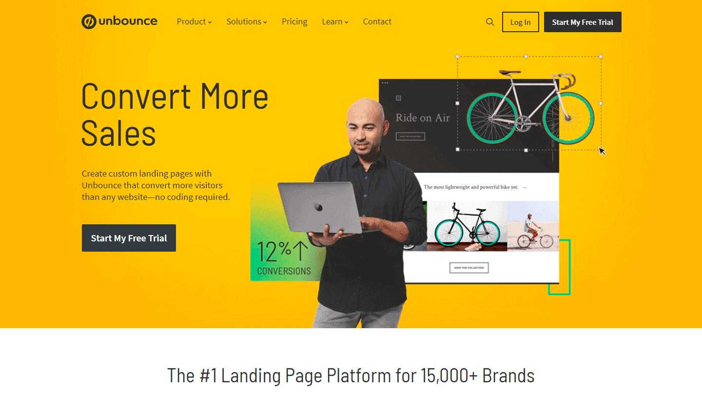
A discreet logo, an eye-catching title and subtitle, a description that really highlights the benefits of the offer, a very nice mockup in the middle of the page and a form with just the right amount of fields. In short, everything you need to generate leads!
Discover the best tools for creating your landing page.
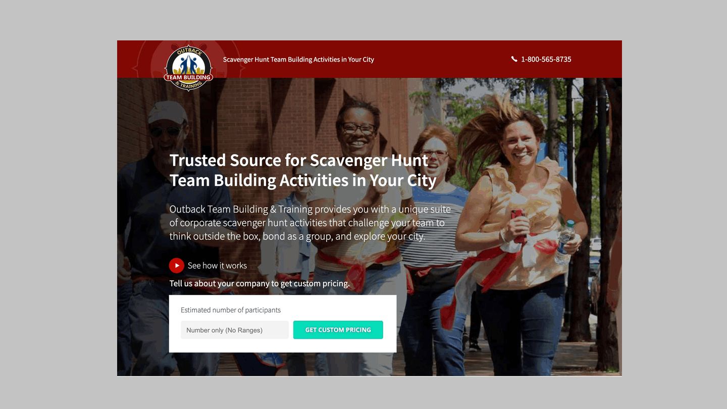
#9 Outback Team Building & Training: Use dynamic text replacement
Marketers sometimes think that personalisation is not as important when it comes to B2B. But it’s almost always a good idea to be as specific as possible with your homepage.
This is where Dynamic Text Replacement (DTR) and the example of Outback Team Building & Training, built by Unbounce, stand out. The original title reads here: "Trusted source for treasure hunt team building activities in your city". But using DTR and Google Ads Keyword Insertion, Outback’s marketers were able to replace the last part of that headline ("Your City") with the actual name of the city (e.g., "San Francisco" or "Toronto").
With this tactic, they were able to target this one homepage to people all over North America and provide a personalized experience at the same time.
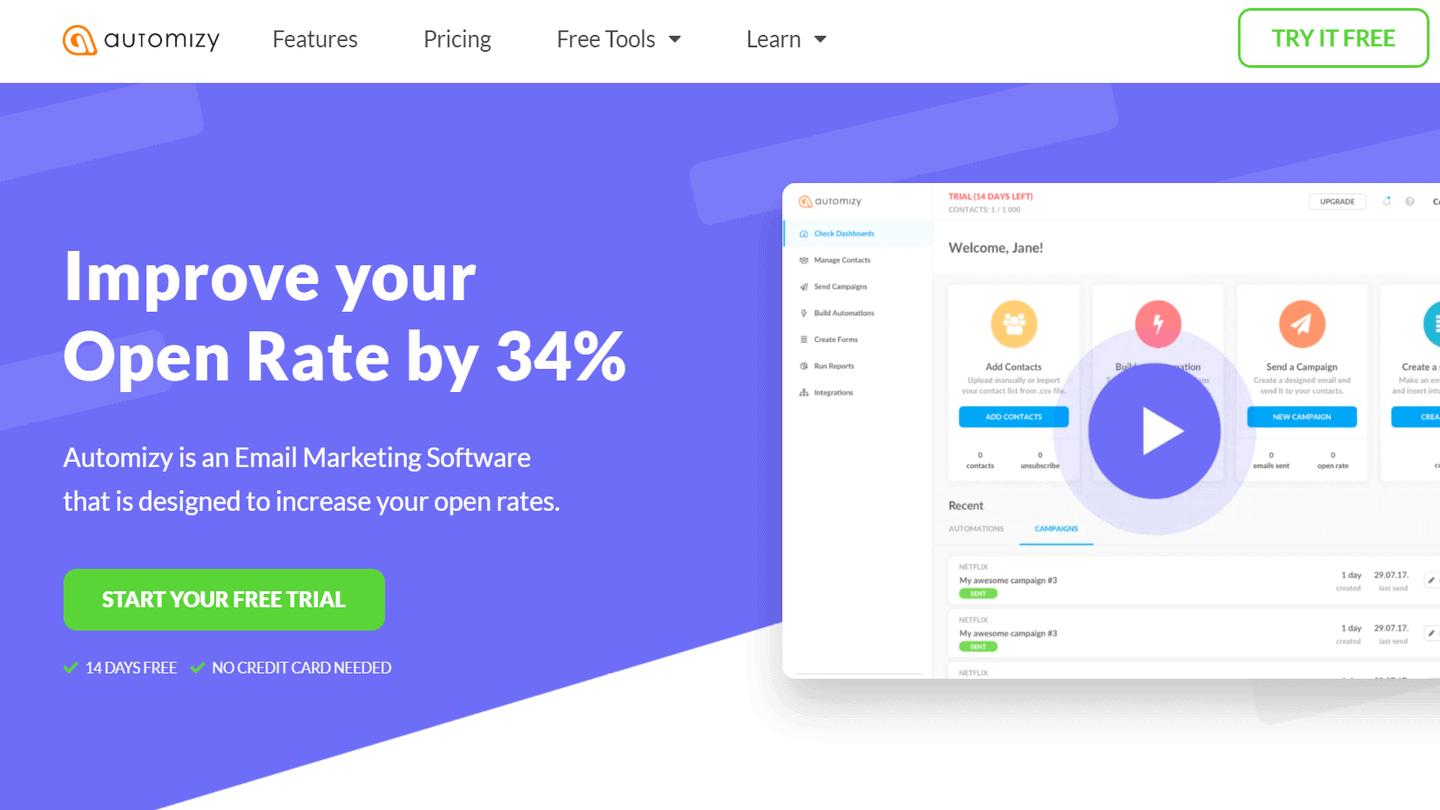
#10 Automizy: Putting forward a compelling proposal
Automizy, as its name suggests, is an automation solution, more precisely Marketing Automation. The landing page is straight to the point: it contains very little text, very few graphic elements, very few fields (for the form), which contributes to its high visibility. Everything is clear and limpid.
#11 Divide: Take prospects through several stages of the customer journey
Sales cycles vary from industry to industry, but the process always starts with creating interest and (ideally) ends with a purchase decision. And that’s the advantage of well-designed landing pages: you can guide the reader through each of these stages by scrolling up and down, without them ever having to leave the page.
This detailed Divante landing page builds awareness by offering a description of their service (in the first two sections of the page), guiding their prospects through a list of features and benefits, and then driving conversions by detailing the plans available alongside their calls to action (i.e. “Choose a plan” or “Request a quote” respectively).
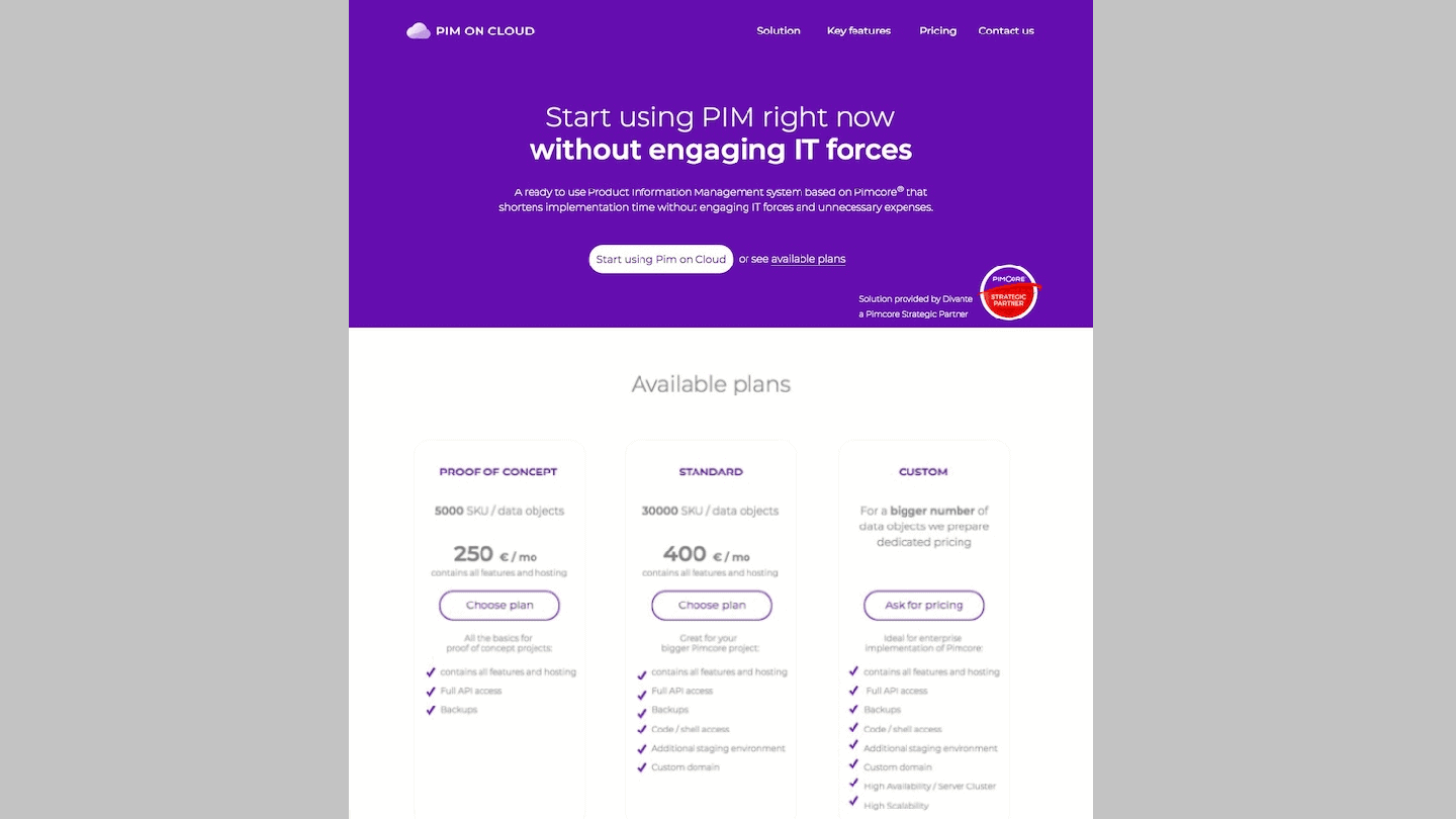
Of course, some visitors will also know exactly what they’re looking for right off the bat, which is why Divante also includes an anchor navigation on this page for a choice experience of your venture. Because of this, more qualified prospects can jump straight to the details that interest them most. This makes a longer page like this much more digestible.
#12 Litmus: Offer free resources on key topics
Litmus is an email marketing tool, best known for its email testing tool. Every year, the editor publishes a report called “State of Email”, full of statistics onemail marketing. It is for Litmus a powerful tool for B2B lead generation. The landing page that offers the report is very successful. Here’s what the landing page looks like for the 2018 report:
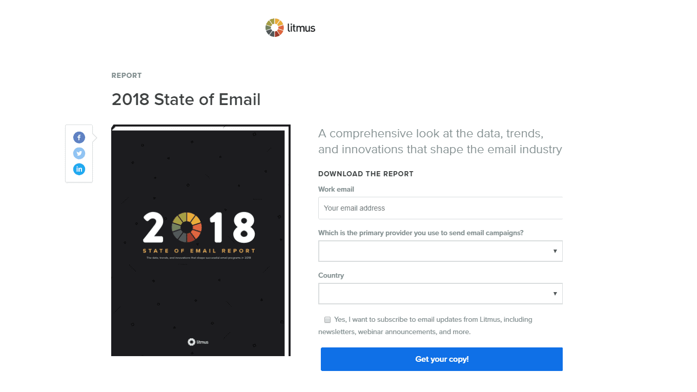
The design is very clean. The essential elements are well highlighted. The colour scheme is also very well chosen. White in the background, several shades of grey and colours only for the salient elements: the mockup, the logo and of course the blue CTA which stands out very well.
#13 Salesforce: Let the numbers do the talking
Like the previous example, this page from Salesforce shows you that appearance is not everything. Indeed, even if you remove all the design elements and photographs, you still have a convincing argument for trying them.
Optimise your business processes with our comprehensive guide to CRM integration.
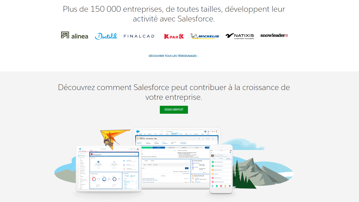
Data can be very persuasive, especially in the B2B sector where customers need to see these precise figures to ensure they are making the right decision. Here, Salesforce shows how widely their tool is used around the world with a shocking figure: “More than 150,000 companies are doing business with Salesforce”. They are asserting their position as the world’s number one enterprise CRM company.
#14 Blink: Add testimonials to build trust and credibility
Testimonials are always important. While a photo and a quote from one of your customers can sometimes be helpful, there are other ways to build trust on your homepage.
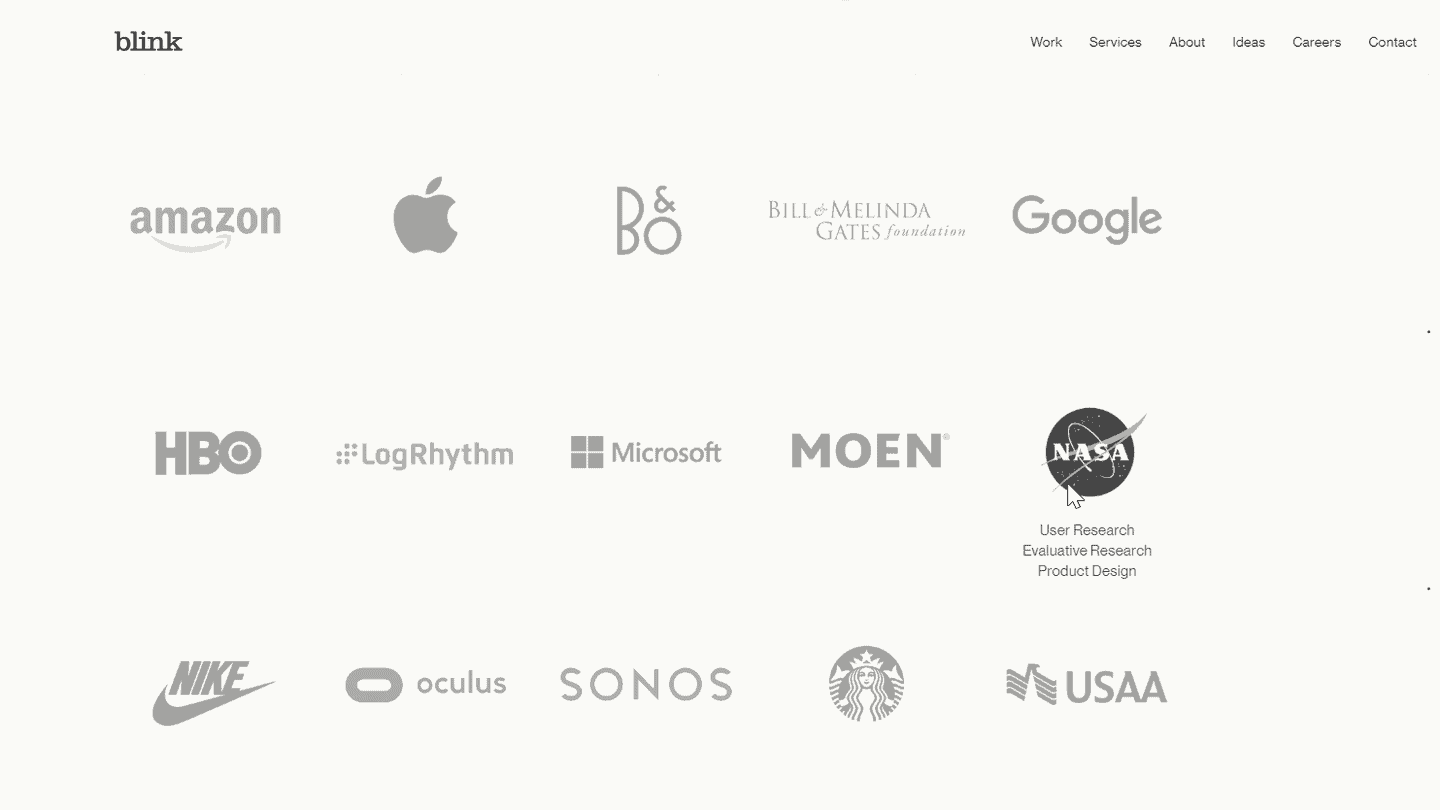
This example from Blink shows three types of social proof you can incorporate to persuade visitors. First, they hit you with logos of some of their “preferred customers”, which include very influential companies like Google, Starbucks, Amazon and NASA. Secondly, the page shows you some testimonials from their satisfied customers. Finally, it shows some of the awards Blink has won over the years for closing the deals
Including one or two testimonials can be useful, for sure. But when you include so many testimonials on the page, it’s hard to resist.
#15 ActiveCampaign: Answer the problem that concerns your visitors the most
When someone clicks on your landing page, you usually have less than 15 seconds to get their attention and show them that they are in the right place. This is especially true in the B2B world, as decision makers are trying to solve a specific business problem.
Take this example from ActiveCampaign. They don’t just target visitors who are looking for any email marketing platform. They are targeting visitors who are looking to automate their customer experience. So they don’t hesitate to address you directly with the page title: “Don’t just automate your emails, boost your entire customer experience”.
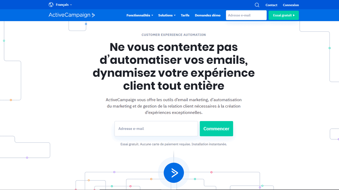
Notice that the title does not focus on the platform or the specific features that ActiveCampaign has to offer. It focuses on the visitor and the goal they are trying to achieve.
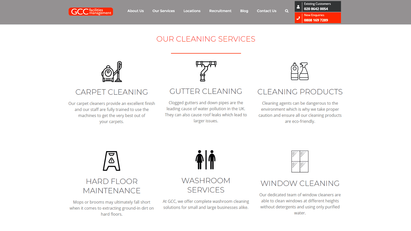
#16 GCC Facilities Management: Use iconography to make your page easier to follow
It’s so easy to overload your homepage with too much text that 90% of visitors will never read it. You want to explain your product or service, and it’s not always easy to do so in 140 characters or less.
This homepage shows how clear iconography can help convey ideas more visually, even if visitors don’t read all your text. Each point on the page is punctuated with an illustrated icon for people who are quickly scanning the page. They cleverly use the same brand colours throughout the page to give a nice cohesion to the whole.
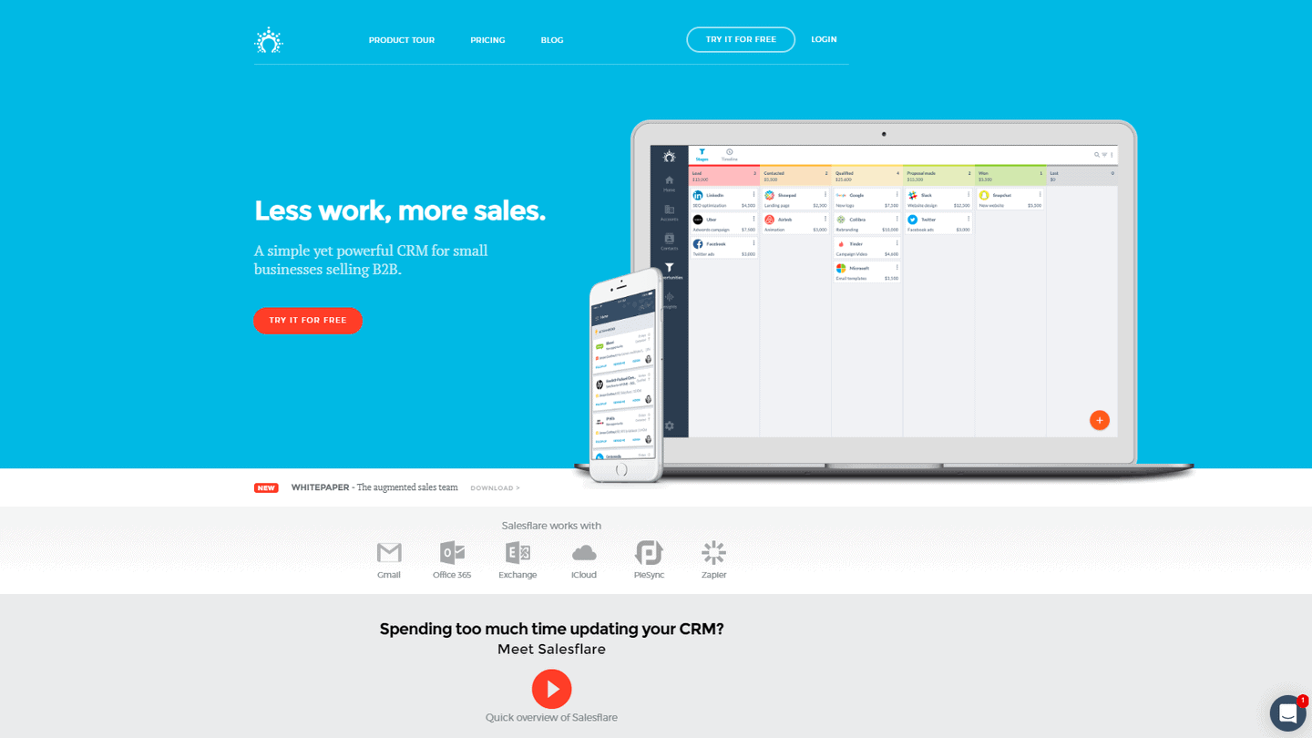
#17 Salesflare: Answer the big questions your visitors might have
The page then explains that when you get tired of using free Excel templates (like the one you’ve just downloaded), you can start your free trial of Salesflare. Using the same question and answer approach, the page then covers the benefits of the software and why you should use it.
The lesson for B2B marketers? Try to get into your visitors’ heads and answer all their questions before they even think of asking them.
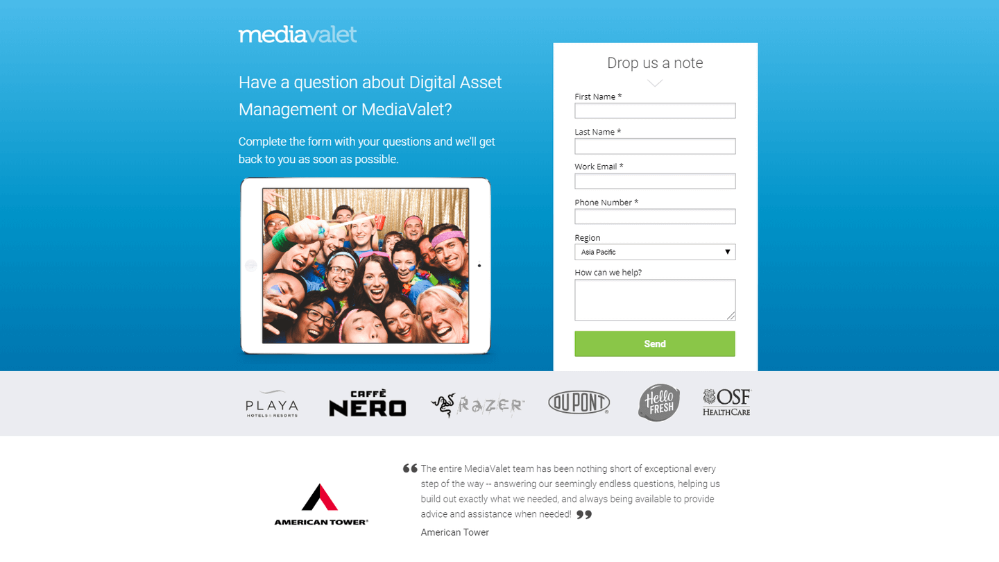
#18 MediaValet: Use the rule of three for your layouts
MediaValet is a digital asset management company that applies the rule of three when presenting its key benefits and testimonials. This clear, concise and easy-to-use structure is also key to the success of the landing page: it introduces the product, backs up its claims with statistics and allows potential customers to request a demonstration. The more your visitors can consume and retain the content of your homepage, the better equipped they are to make a buying decision.
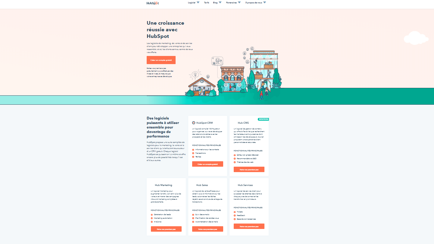
#19 HubSpot: Try segmenting your leads
How do you tell visitors about your B2B tool if you don’t know who they are or why they want it? Many SaaS platforms face this challenge because they have multiple different targets and use cases – which means it would take a lot of space on the page to explain each important point to each person.
That’s why this example from HubSpot caught our attention. Rather than going into detail about how different segments can use their software, HubSpot created a short landing page to direct each segment to its own custom demo. It’s a bit simple, but it gets the job done.
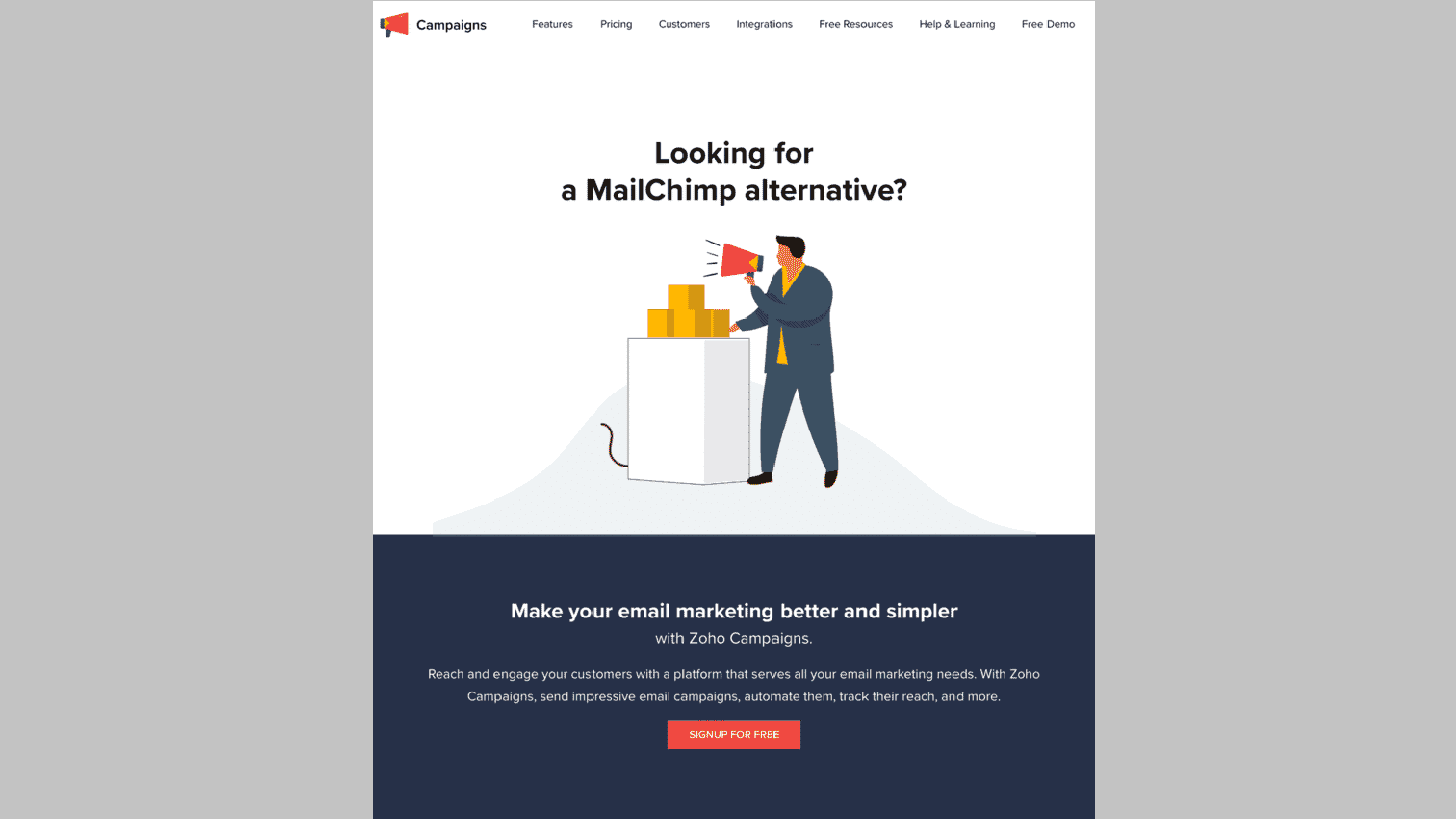
#20 Zoho: Target your competitors
When evaluating B2B tools, business owners rarely make a purchase based on the first landing page they see. As this is a business investment, most people want to be patient and consider all their options before making a final decision.
This is why competitor landing pages have become important. The idea is that you can bid on a competitor’s keyword using Google Ads, and create a landing page that directly compares your product or service to the one visitors are actually looking for.
This page from Zoho appears when you search for “Mailchimp alternatives”, for example. While you can’t use your competitors’ names in your ads (which can get you into big legal trouble), you can use them at the top of your homepage to make the page more relevant. This is an interesting approach that allows many companies to bid on their own brands to avoid competition.
#21 Yellow Pages: Reassure your prospects with social proof
Yellow Pages is the American equivalent of the Yellow Pages in France. It allows you to find the address of companies. Here is one of their landing pages, simple but effective:
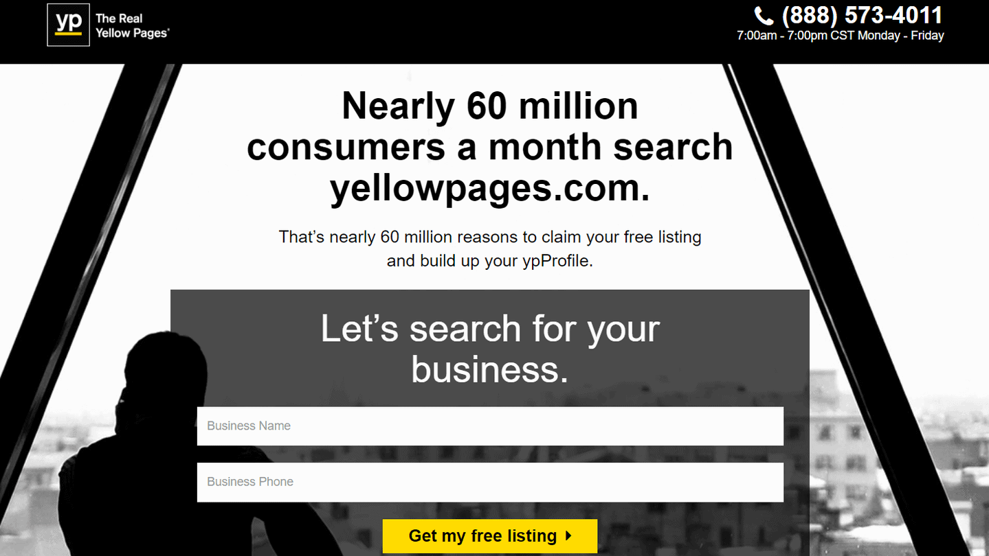
The upper part of the page shows a small, discreet logo with the slogan (on the left) and contact information on the right. Just below, a reassuring sentence, a social proof as they say: nearly 60 million consumers use the service every month. We are reassured! Below that, a minimalist form that only asks for the really necessary information. And finally, even lower down, the CTA which is particularly visible thanks to its yellow colour which contrasts well with the black and white of the rest of the page. This is a very important point: CTAs should always stand out.
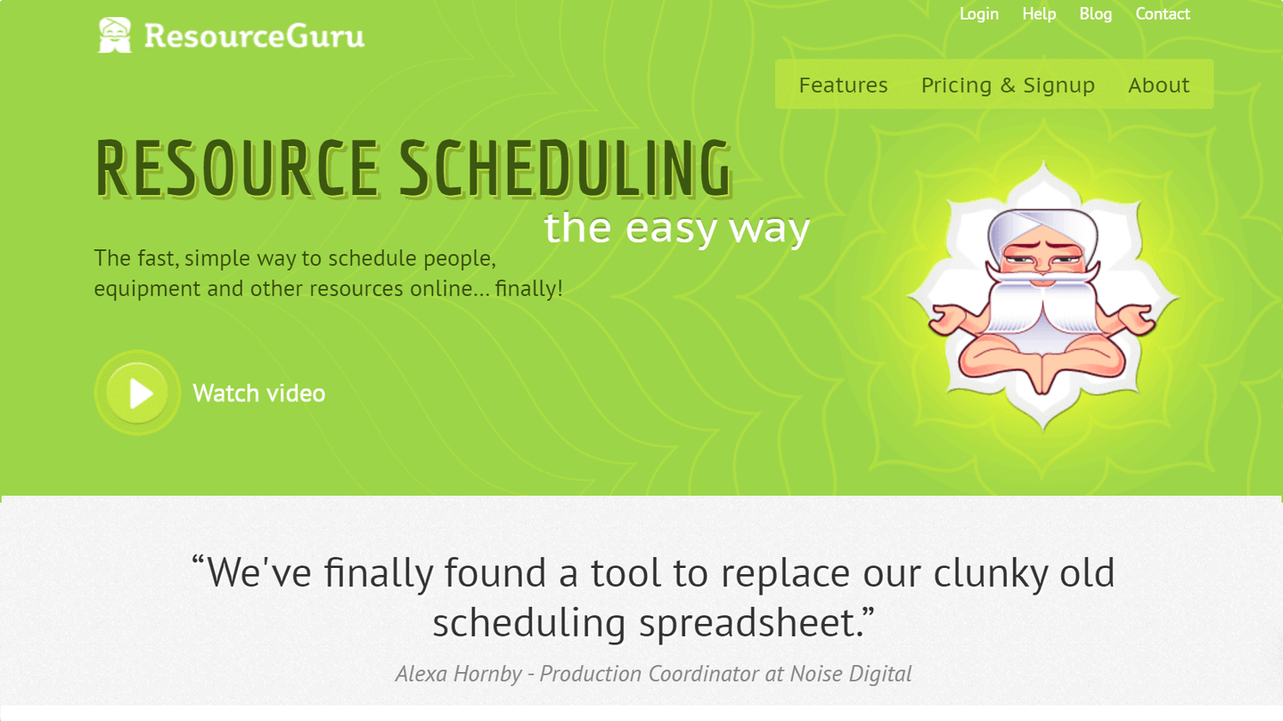
#22 Resource Guru: Help prospects understand a complex idea with video
Many B2B products and services solve complex problems. Therefore, landing pages should be designed in such a way that potential customers can easily understand the features and benefits of these products. One way to do this is to incorporate visual elements such as videos, images and even animations, all of which can help drive conversions.
Resource Guru’s homepage is effective in that it greets viewers with a large play button as soon as they land. Pressing the “play” button is intuitive and launches a high quality explanatory video. They let this video do the talking, then quickly ask visitors for an action.
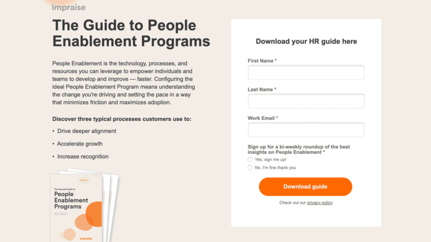
#23 Impraise: Use landing pages to engage new leads
E-books, webinars and other free resources can be very useful in attracting visitors to your brand and collecting their contact details. From there, you can build a real relationship with each new lead until they are ready to engage.
Take this example from Impraise. They used Unbounce to create a lead capture page targeting HR professionals. There are no distractions on the page, the focus is on the free resource: “The Guide to People Enablement Programs”. Visitors have the option of downloading the guide directly from this page in exchange for their email address, or – if they are already looking for performance management software – to explore the Impraise platform.