Have you used your buyer personas to build your landing pages? Your content can be powerful, but if it is not adapted to the profile of your visitors, the results will not be as good as you expect. The text and design you use to target the C-levels of a large corporation and the founders of a start-up will be very different.
To maximise your conversion, the content and design of your landing pages must therefore be adapted to your buyer personas! How do you do this? That’s the subject of our article 🙂
Sommaire
How can you optimise the content of your landing pages using buyer personas?
#1 Use an approach adapted to your persona
Not all your customers react in the same way to your sales approaches: a “soft sell” approach speaks to your highly motivated buyers but has less impact on your leads at the beginning of your sales funnel.
Start by editing your landing page text to focus on the following points:
- Age: casual and original text may be appropriate for a young audience, but have the opposite effect on older visitors.
- Role and sector: Decision-makers from conservative industries (e.g. banking or insurance) need a more sincere and reliable text than visitors from younger industries (such as technology or design).
- Motivation level: The “hottest” prospects require a lighter sales pitch than your leads still at the beginning of your sales funnel. Modify the length, style and persuasiveness of your text accordingly.
Salesdorado’s advice
Ask your customers and use their own quotes to make sure your content matches their expectations. Take a look at Copy.ai to find content ideas that fit a certain tone. It’s all in English, but it still works quite well in French.
#2 Addressing specific objections to personas
Each persona will have different needs and objections. The content of your landing page should address these specific objections.
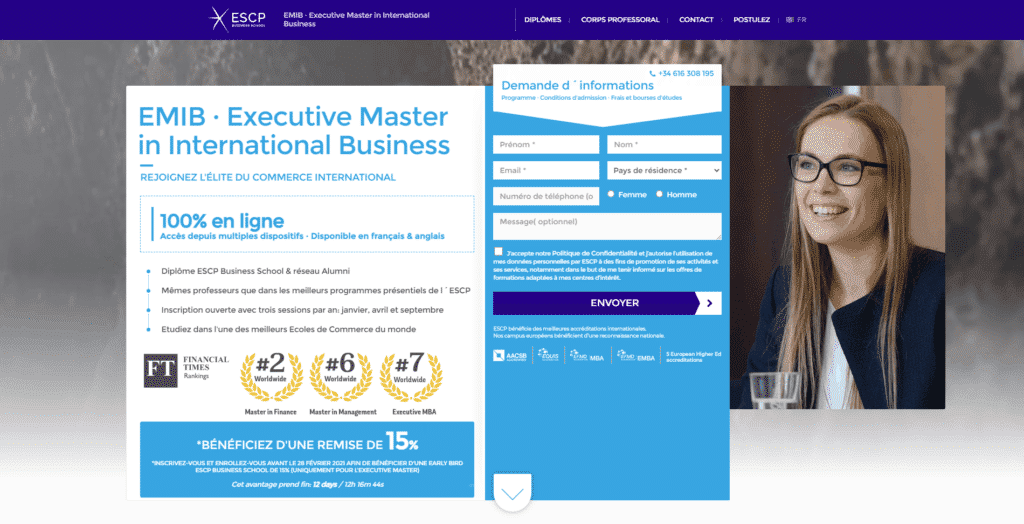
Students considering a 100% online Master’s degree have two major concerns:
- The reputation of the programme: hence the mention “ESCP Business School Diploma & Alumni Network“.
- The quality of the teaching: hence the mention “Same professors as in the best ESCP face-to-face programmes”.
#3 Use appropriate trust markers
A “trust marker” is a proof of recognition and quality of your product or service. Here are some examples of trust markers:
- Accreditations
- Awards within your industry
- Testimonials
- Social evidence (number of existing clients, featured in and logos of clients, etc.)
- Customer reviews
The way your personas react to different trust markers is not always uniform. A testimonial from an authority figure, for example, is only useful if your visitors recognise that authority figure.
This is why you need to tailor your trust markers to your personas.
Let’s go back to the homepage of the ESCP online Master’s programme. It is impossible to miss the badges indicating the school’s position in the Financial Times ranking.

EQUIS or AACSB accreditation is also intended to increase the confidence of prospective students in the reputation and quality of the programme.
#4 Adapt your positioning
The same product can be sold in different ways. The way you present the product and its benefits is the “positioning” of your product.
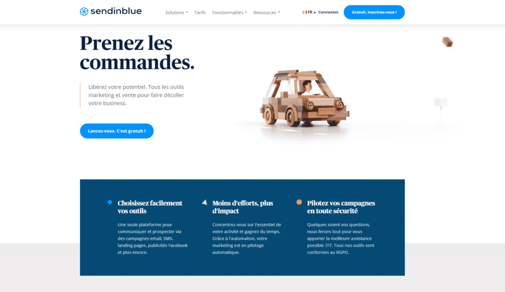
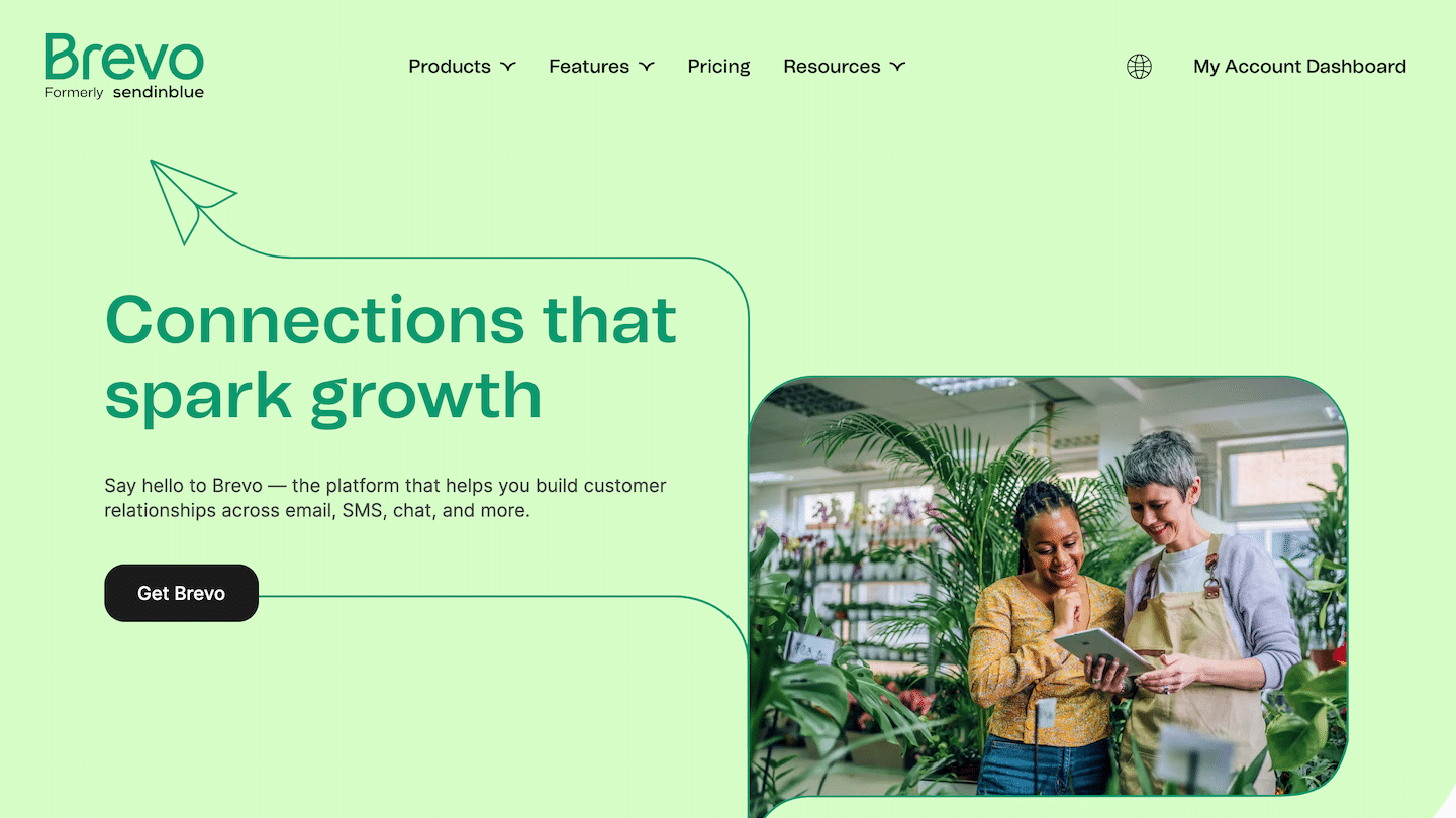
As Sendinblue does very well above, if you offer email prospecting software, you can choose to focus on these benefits:
- Ease of use – For new customers who want to tryB2B email marketing for the first time, or for existing users who are tired of inconvenient tools.
- Marketing automation features – For clients looking to improve productivity.
- Security and deliverability – For customers who are fed up with the poor quality of their existing solution.
Ideally, your positioning should match the needs and wishes of your buyers.
Use the following process:
- #1 Identify what they want from your product (e.g. “save more time”, “get more reliable data”, etc.). This is the well documented “Jobs to be done” methodology
- #2 Identify which part of your product meets this “need”.
- #3 Highlight this solution on your landing page
This changes your homepage from a generic “our product does X” message to a specific “our product does X for customers like you” message.
Optimise the design of your landing pages thanks to your personas
If you use the same design or template for all your buyers, you are lowering your conversion rates. If you sell to both 70 year olds and 18 year old students, you will need different templates and designs.
#1 Addressing UX issues
The first point is to build landing pages that are easy and pleasant to use for your buyer personas whose web habits are different.
For example, if you are targeting an older person, a smaller font or CTA may make it difficult for them to read.
Consider the following when making your design choices:
- Age: Older personas may have difficulty reading smaller font sizes.
- Device used: If your persona accesses the web mainly from a mobile device, focus on the responsive aspect.
- UI elements: UI elements, such as “burger menus” may be obvious to young people, but may confuse older users.
- Screen size of the desktop: The larger the screen size, the more “above the fold” space (i.e. the space visible before you have to move the cursor down). Take into account the screen size used by your visitors when creating your landing pages.
#2 Choice of colours
Your colour choices affect how your visitors perceive your brand. Although the effect is subtle (psychologically), it can have a significant impact on conversion rates.
There are three things to consider when choosing colours:
- Age: Young people prefer warm, bright colours like red. Older people prefer cooler colours such as blue and green.
- Gender: In addition to age, there is also a gender orientation in the choice of colours. If possible, use a suitable colour.
- Type of person: Colour psychology implies that different colours have a different impact on how people perceive an object (in this case, a landing page). If you are targeting low-information, low-confidence first-time users, you want to convey confidence and stability (that’s why you should use blue). If you are targeting very knowledgeable and experienced people, focus on action and optimism (so use red or yellow).
Salesdorado’s advice
Try to use colours adapted to the age and demographic profile of the buyer, and anticipate any doubts (overt or unconscious) of your personas.
#3 Choice of UI/UX
The entire design of your landing page, from the placement of your CTAs to the length of your forms, depends on two things:
- Experience with the computer tool: Younger users who have used these tools all their lives are more comfortable and do not need much guidance. Older users will need more explicit instructions and more obvious design choices to guide them towards completing an action.
- Interest of the lead in your solution: “Hot” prospects, identified through your lead scoring strategy, will be more willing to give information than low or less motivated leads. This will have an impact on the length of your form.
#4 Choice of images
The easiest way to enable a prospect to identify with your offer is to use an image specific to that persona. That is, use an image that :
- Promotes a person the prospect can identify with (age, gender, same clothes, etc.)
- Shows an emotion or activity you want the character to feel
It is also possible to use video for more dynamism while allowing your prospect to identify himself.
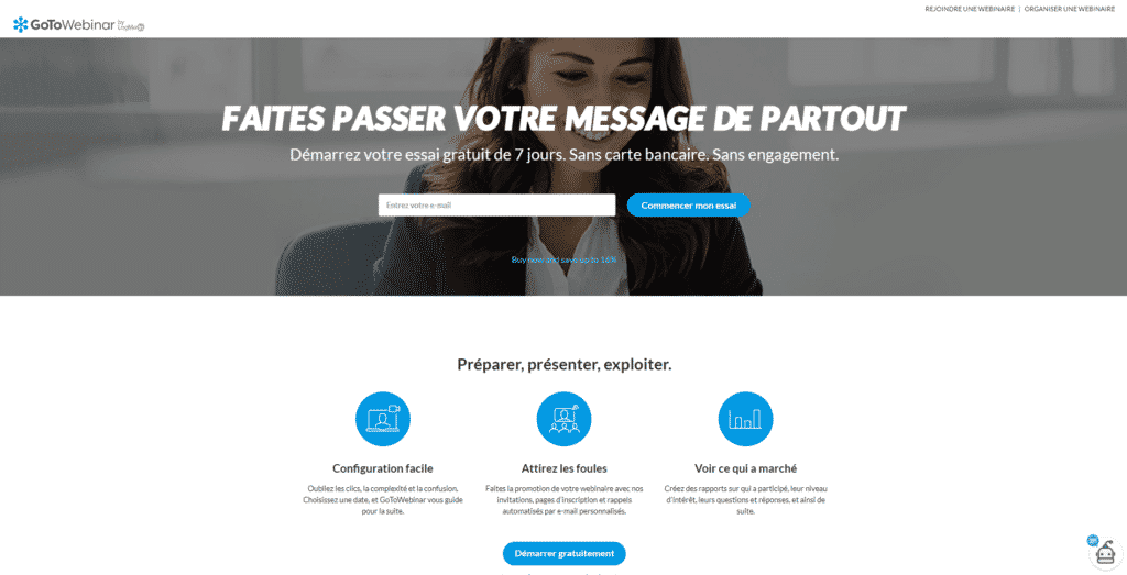
Here, GoToWebinar allows professionals who want to use webinar software to identify themselves with this person who sends back an executive image.
Your buyer personas are the heart of your sales and marketing strategy. The entire design of your landing pages, from text to design, should be guided by the characteristics of your preferred targets.
This process can be time consuming, but with the right landing page creation tool, you’ll get there.
Start by creating an initial design with test variants that you can adapt to your different targets. Even test several variants for the same target on a part of your audience, compare the conversion rates and maintain the best performing version!
The result? Higher conversion rates and more satisfied customers.
Want to build landing pages that convert? Use our resources on the subject 🙂
- 23 examples of successful landing pages
- 10 tips for building optimised landing pages for lead generation
- Discover our comparison of landing page creation tools